Article
Figma to Webflow plugin: how to move your design into Webflow
Webflow15 min read

James BrunettoCo-fondateur & CEO
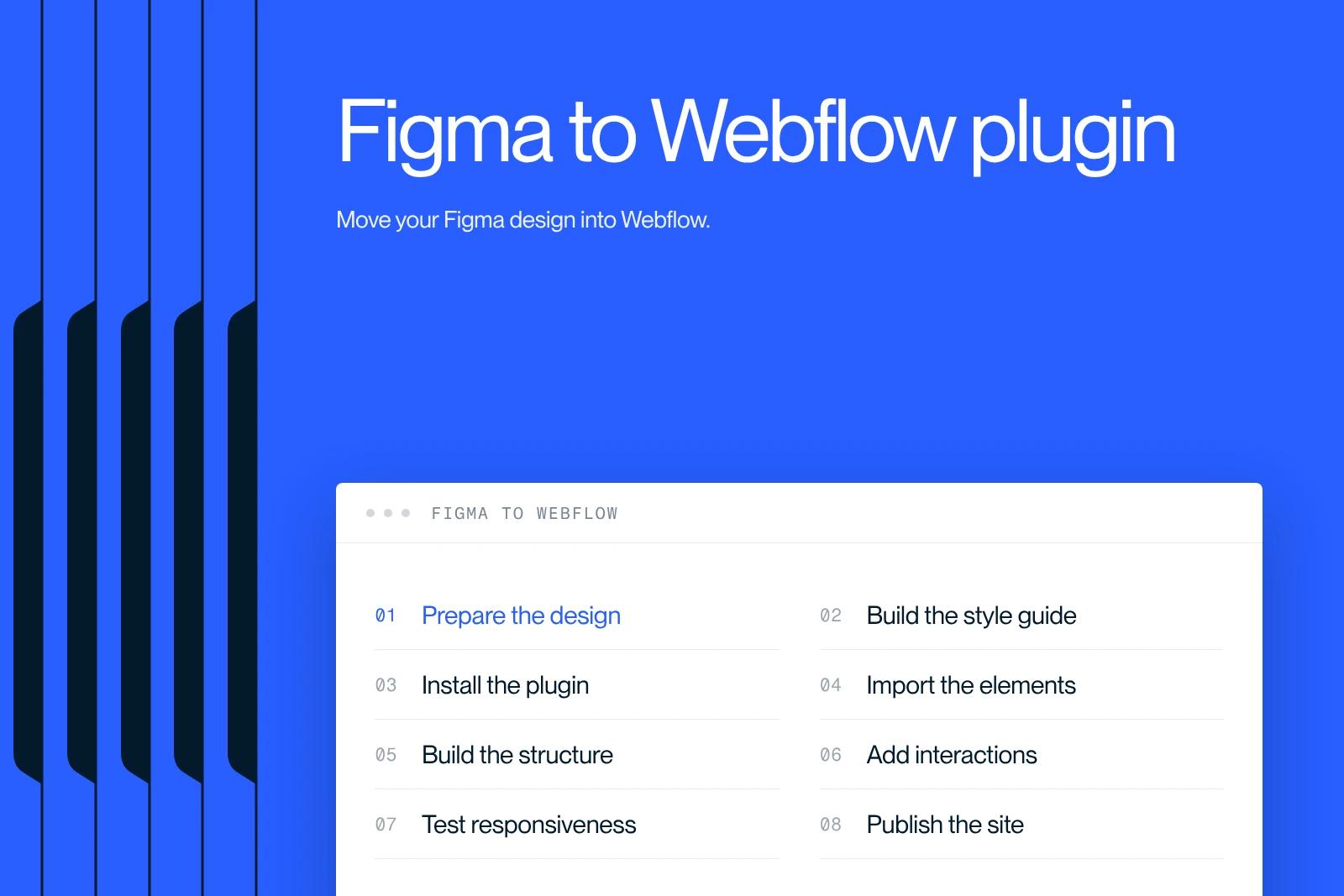
Want to turn your Figma designs into a Webflow site without the struggle? This is the plugin you need, and it saves real time.
Explore this post with…
In this article from our Webflow agency Synqro, we fully revisit the "Figma to Webflow" topic so you can turn your designs into a modern, responsive, SEO-ready Webflow site. The method is based on the latest practices (2025) used by Webflow experts and on the official recommendations. The goal is to provide a reference guide on moving from Figma to Webflow.
1. Why move from Figma to Webflow
Figma is a collaborative design tool for creating interfaces, while Webflow is a visual CMS that turns those designs into interactive websites without code. Moving from Figma to Webflow has several advantages:
Consistency from design to site: your designs stay true to your original intent if you prepare your files properly and follow best practices. Webflow converts Figma layers into classes and components during sync.
Time saved: with the Figma to Webflow plugin, variables, components and styles can be synced quickly.
Easier maintenance: Webflow relies on a system of reusable classes and components. A well-planned structure makes updates and growth easier.
Performance and SEO: Webflow produces clean code that can be optimized. Using variables, light animations and modern image formats (WebP, SVG) improves load times and search rankings.
2. Prepare your Figma designs for the build
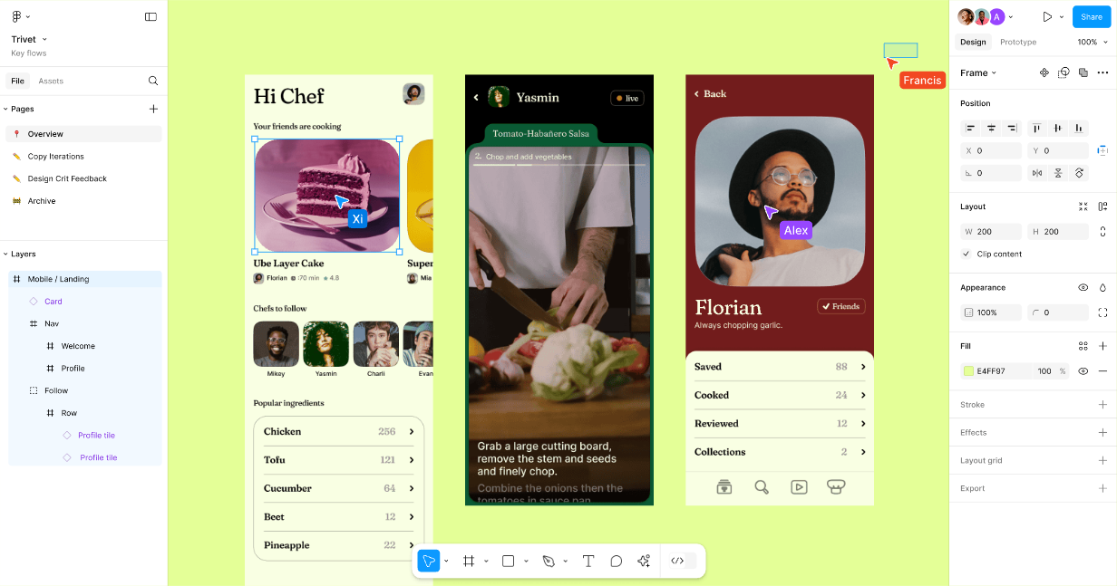
Before moving your design, it is essential to structure your Figma file properly:
Use a 12-column grid: Nocode Factory recommends a 12-column grid with a 940 px container width, which matches Webflow's default grid. This keeps Figma and Webflow consistent.
Create components and global styles: save reusable sections as components in Figma, similar to Webflow symbols. This avoids duplicating work.
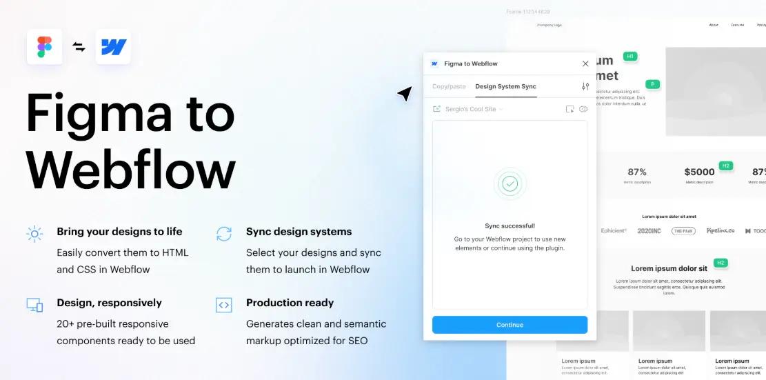
Define a color palette and variables: save your colors in Figma and group them (primary, secondary, accent, neutrals). During migration, these colors become Webflow variables. Also check contrast for accessibility; the WebAIM tool is recommended for testing your contrast ratios.
Prepare your typography: Figma and Webflow both use Google Fonts, but if you use custom fonts, upload them to Webflow before syncing. Also set a type scale (H1, H2, paragraphs and so on) and record it in your style guide.
Turn on auto layout: the Webflow plugin can only sync layers that use auto layout. Use this feature in Figma (or the "suggest auto layout" tool) to get an accurate translation.
Optimizing assets
Export your images and icons: use WEBP for images (it combines JPG and PNG strengths for efficient compression) and SVG for vector logos and icons. Use JPG if most of your users are on older browsers. Avoid heavy PNGs unless you need transparency.
Name your files properly: file names affect organization and SEO. Avoid generic names like IMG001.jpg; choose descriptive, lowercase names, for example team-meeting-2025.webp.
Optimize the size: export images at @2x from Figma to get high-resolution assets. Reduce their weight with dedicated tools or in Webflow (which offers image conversion).
Prepare favicons and webclips: export your favicons at 32×32 px and 256×256 px, and plan a hamburger menu icon for mobile.
3. Create a new project and a style guide in Webflow
Creating a new project in Webflow is the first step on the CMS side:
- Create a dedicated project: open Webflow, click "New project" and create a specific folder. This structure mirrors the organization of your Figma files and makes importing easier.
- Style guide page: create a "Styleguide" page or folder to define default styles (headings, paragraphs, links, buttons, colors). Elias Studio recommends setting up this page before starting the build, to centralize typography, color and test URL settings.
- Variables and global classes:
Add your colors as Variables (primary, secondary, accent, neutrals). Give each variable an explicit name (e.g., --color-primary, --text-primary) and organize them by theme (light/dark mode).
Create a type scale as variables: H1, H2, paragraphs and so on, with sizes and line heights specified.
Define spacing tokens (space-xs: 4 px, space-sm: 8 px and so on) to standardize margins and padding.
4. Install and use the Figma to Webflow plugin
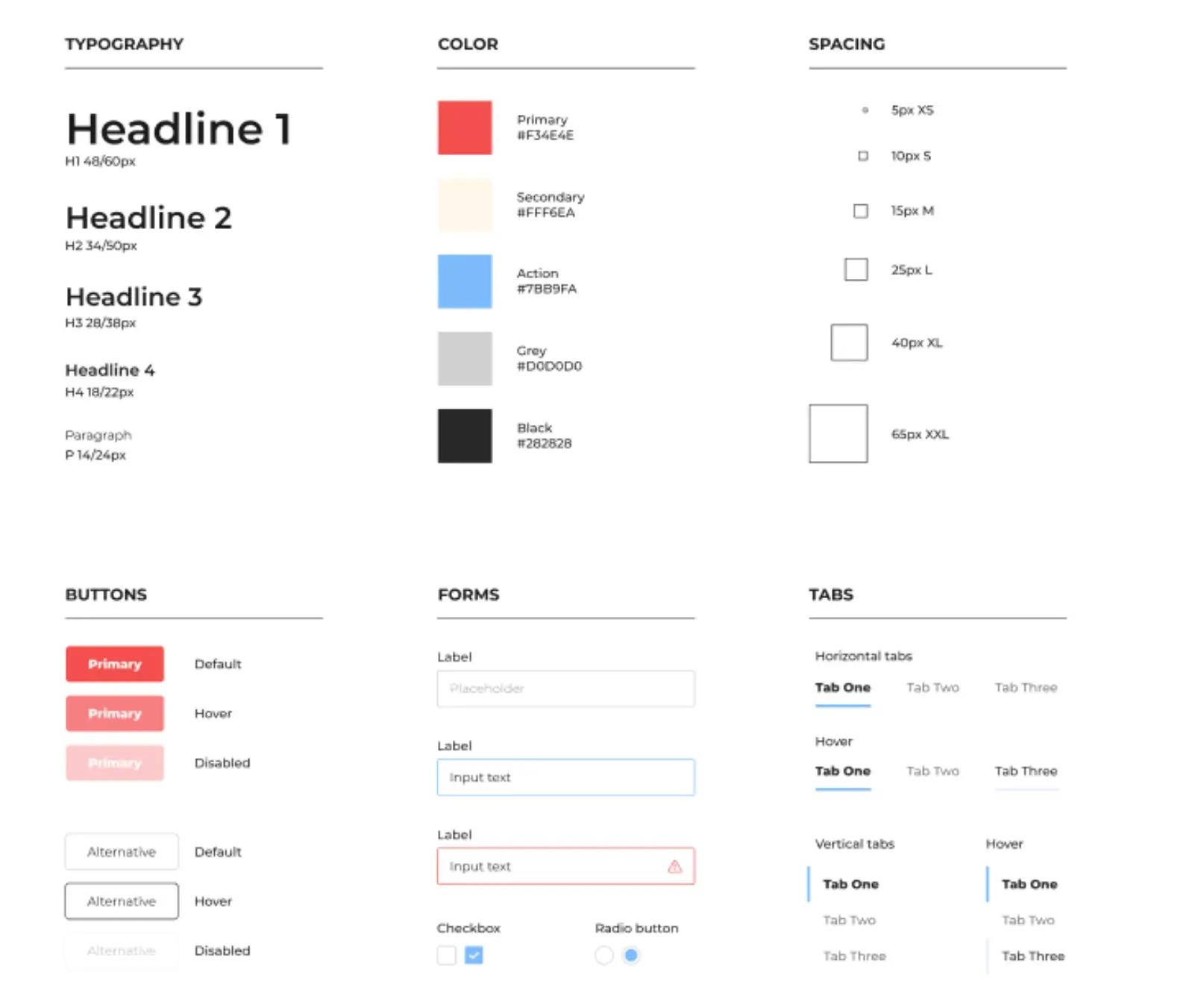
Webflow provides an official plugin that syncs your Figma designs:
Installation and authorization
Installation: in Figma, open the Figma to Webflow plugin (via Plugins > Search). Open a Figma file and click Run to launch the plugin.
Connecting to Webflow: click Next > Connect, choose the Webflow site or workspace to link and authorize the app.
Choosing the site: in the plugin, select the Webflow site you will import elements into.
Organization and sync
The plugin has three tabs:
- Layers: to export layers (frames or components) from Figma to Webflow.
- Variables: to sync color and size variables.
- Styles: to export text and effect styles as Webflow classes.
The steps to sync layers:
Select one or more layers (frames or components) in Figma, then click Continue and Sync to Webflow.
In Webflow (via the Apps panel), select the most recent sync and choose the components, elements and variables to import.
Tip: for large pages, Webflow recommends syncing only a few components or sections at a time.
Managing classes and conflicts
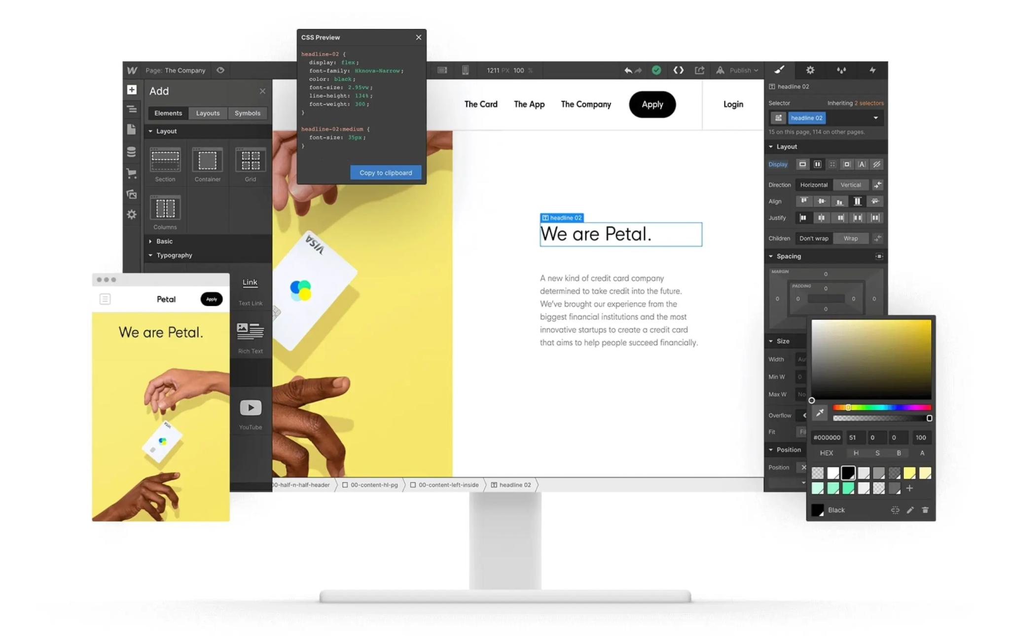
Automatically generated classes: each Figma layer is converted into a Webflow class during sync. You can add a prefix to identify imported classes.
Paste shortcuts: when a class already exists on your site (e.g., "Button"), you have three options: create a new class (Cmd/Ctrl + V), reuse the existing class (Cmd/Ctrl + Shift + V) or update the existing class with the Figma styles (Cmd/Ctrl + Option/Alt + V).
Syncing variables: you can sync one collection and one mode at a time (for example, light mode variables). The plugin lets you set the unit (px, em, rem) and the base size.
Limitations: the plugin does not handle component variants. Each variant must be a separate frame. It is not available on Safari.
5. Build the Webflow structure: sections, containers and divs
Once your elements are synced or exported, you need to reproduce the Figma hierarchy in Webflow:
Sections: they match the top-level frames (hero, footer and so on).
Containers: they center the content. Use Webflow's built-in container or a div with a max width.
Div blocks: used to build detailed layouts, similar to nested groups in Figma.
Grid and flexbox: use the Grid layout for regular structures (galleries, cards) and Flexbox for navigation bars or centered sections. Keep the same margins and padding as in Figma to match the design.
Semantic structure: use semantic tags (header, section, footer) to improve accessibility and SEO. Webflow automatically assigns HTML tags based on layer names (e.g., "heading" becomes H1, "description" becomes a paragraph).
6. Build a solid design system in Webflow
A design system makes maintenance and consistency easier:
Colors and variables
Variables by category: organize your colors into categories (primary, secondary, accent, neutrals). Give them explicit names and, if you use dark mode, group your variables by theme (light/dark).
Contrast checks: check the contrast of your color combinations with tools such as WebAIM to meet WCAG standards.
Typography
Import your fonts: connect your fonts through Google Fonts or Adobe Fonts and upload custom fonts directly to Webflow. Limit the number of fonts and weights to improve performance.
Define a type scale: create variables for each level (H1, H2 and so on) to keep visual harmony. Adjust typography by breakpoint (smaller sizes on mobile).
Spacing and sizes
Spacing tokens: create variables for margins and padding (e.g., --space-sm: 8 px, --space-md: 16 px). Use generic classes (margin-medium, padding-large) for consistent vertical and horizontal rhythm.
Test variations: view your pages with different content lengths to check that spacing holds up.
Reusable components
Identify patterns: turn repeated elements (buttons, cards, headers, footers) into Webflow components. Components let you update a style everywhere in one action.
Component fields: use Webflow's override fields to customize a component's content without changing its base design.
Conditional visibility: show or hide certain elements (e.g., a "Sale" badge) depending on the use case with conditional visibility settings.
Document your components: create a page showing each component with its usage rules and class names. Good documentation makes onboarding new team members easier.
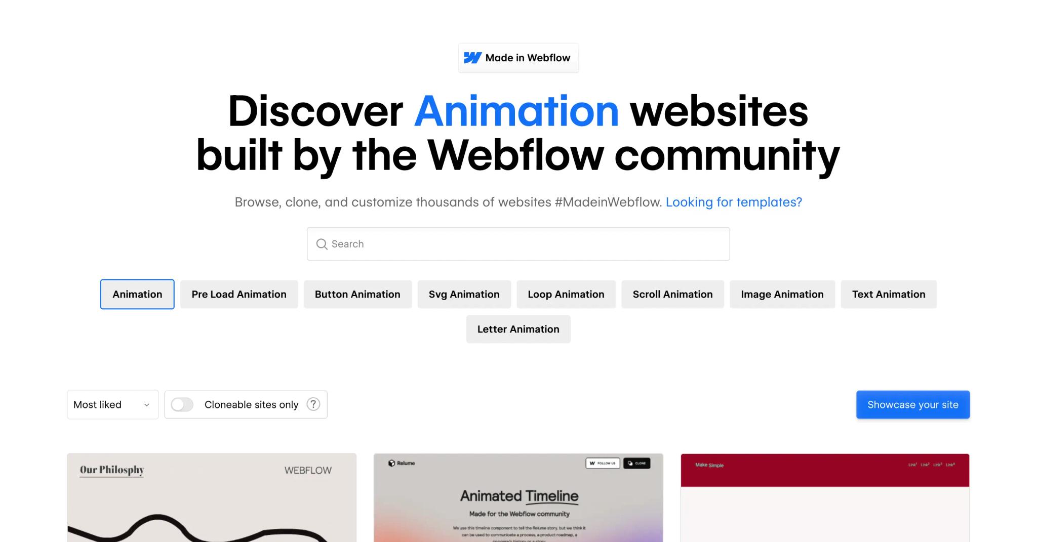
7. Add animations and interactions
Webflow has an Interactions panel for creating animations without code. A few practices:
Micro-interactions: hover effects, color changes or scaling to give immediate feedback.
Scroll reveal animations: elements appear as the user scrolls, creating a smooth narrative.
Triggered animations: for modals, dropdown menus or carousels that animate on click or hover.
Performance optimization: avoid piling up animations that slow the site down. Prefer short transitions, test on mobile and compress the files you use (images, videos, Lottie). Group your settings (duration, easing) to keep a consistent look.
Advanced techniques: use Lottie animations (vector JSON files) for complex animations without quality loss, or custom JavaScript for specific interactions.
8. Make it responsive and test on every device
A flexible structure and repeated testing are essential for a responsive site:
Test on different devices: Webflow offers previews, but also test on real smartphones, tablets and computers.
Use breakpoints: use Webflow's default breakpoints and add more if needed. In the plugin, you can set the breakpoint (tablet, mobile landscape, mobile portrait) when syncing.
Modular classes: create classes that adjust padding, margins and typography at each breakpoint. For example, a card component can display as a grid on desktop and as a stack on mobile.
Conditional visibility: hide or show certain elements at a given breakpoint (for example, a specific mobile menu).
Test every component: check your cards, modals and grids with different content lengths to see whether the structure holds.
9. Optimize UX, SEO and accessibility
Beyond how it looks, a Webflow site built from Figma must be fast and accessible:
Semantic tags and structure: use only one H1 per page and respect the hierarchy (H2, H3). Fill in the metadata (title, description) and the alt attributes of images. Add ARIA attributes when elements are purely decorative.
Performance: limit the number of scripts and complex animations. Optimize your images (WebP and compression) and use fonts that keep the load light. Make sure your site meets Google's Core Web Vitals speed thresholds.
Accessibility: check color legibility and font sizes. Test keyboard navigation and screen reader use. Comply with GDPR rules (cookies, consent), as Elias Studio recommends.
Technical SEO: use clear URLs, add a sitemap and 301 redirects when needed. Add structured data (schema.org) to enrich your pages (FAQ, articles, events). Webflow lets you add structured markup in the editor.
10. Publishing, final tests and continuous improvement
Once all the steps are done:
- Publish your site: Webflow lets you publish in one click. Check the result on several browsers and screen sizes.
- Final tests: go through every page and test forms, links and interactions. Use tools such as Lighthouse or PageSpeed Insights to analyze performance.
- Iteration: keep improving your site. Add new pages or elements while following the design system. Track your metrics (traffic, conversion rate) and improve the user experience.
- Plugin limits: for complex or highly customized projects, the Figma to Webflow plugin is mainly a starting point. You still need to adjust the structure by hand, customize classes and add advanced interactions. You can also bring in a developer or a specialized agency to optimize SEO or build custom features.

Conclusion
Converting Figma to Webflow is not a simple copy and paste. It takes careful preparation of the designs, an understanding of how Webflow is structured, a well-planned design system and sensible use of the Figma to Webflow plugin. By following the steps in this guide, from preparing grids and variables to building reusable components, optimizing animations and accessibility, you will get a Webflow site that matches your design and is ready to publish.
This process will make you more efficient, improve the quality of your site and make long-term maintenance easier. Experiment, test your designs on different devices and keep your design system evolving. If you want support on your Figma to Webflow project, our team is available to help you build a fast, distinctive site.
Frequently asked questions
You install the Figma to Webflow plugin directly from the Figma interface. Search for it in the plugins menu, then run it on your design file. Once it launches, you will be asked to authorize access to your Webflow account and choose the target site. After connecting the two platforms, select the layers or components to sync and start the sync. We recommend using Google Chrome or the Figma desktop app, because the plugin is not compatible with Safari. Make sure auto layout is turned on in your frames so elements are correctly converted into Webflow classes during sync. This initial setup greatly simplifies the workflow.