Article
Logo color meaning: what each color says and how to choose
Branding7 min read

Alice RossiExpert SEO Manager
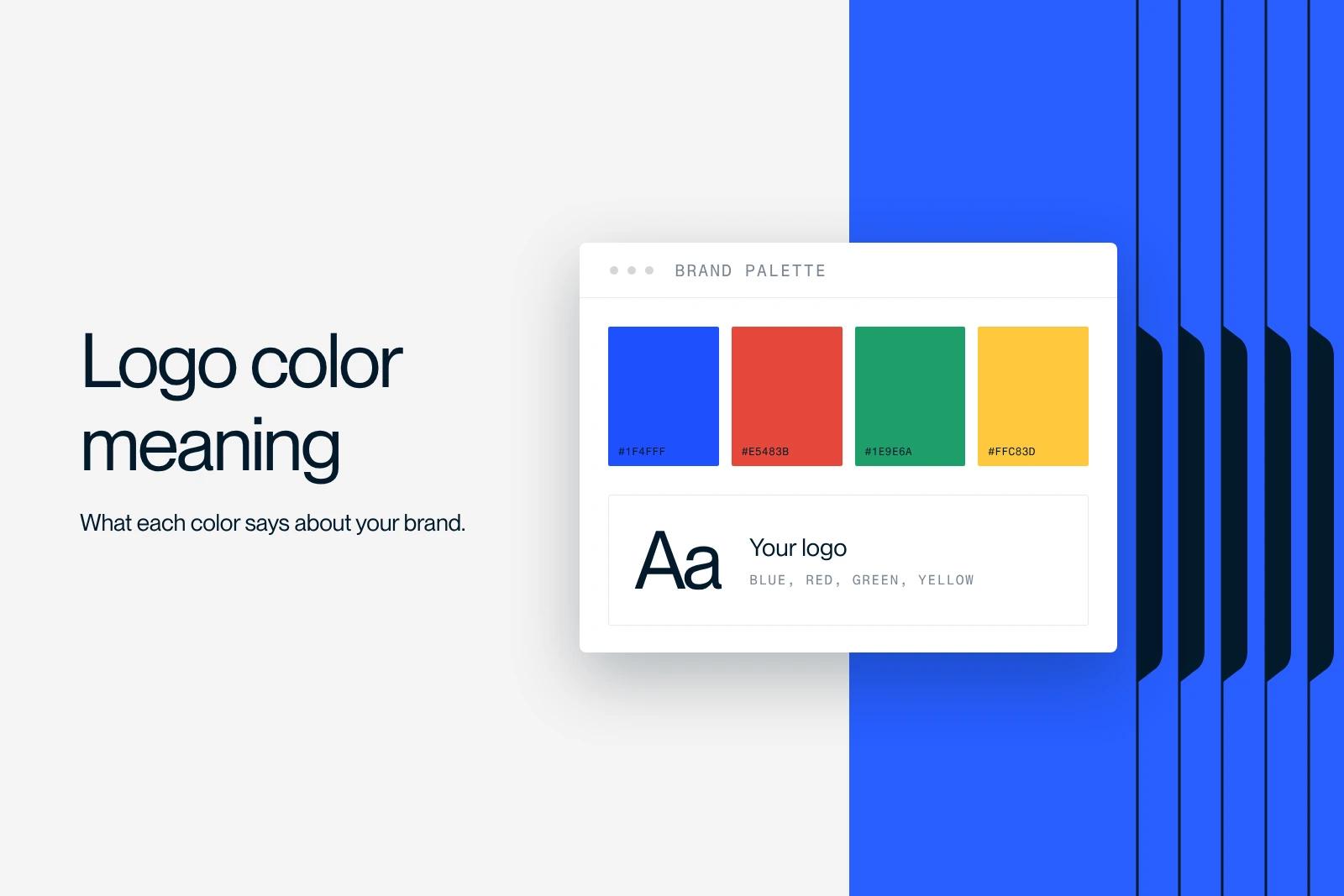
The color of a logo is the first thing the brain registers, even before the brand name. According to several neuroscience studies, color drives a large share of the first impression we form of a brand, often estimated at around 90%. Choosing your logo color is therefore a matter of strategy, not taste. This guide explains what colors mean in a logo, the psychology behind them, how many colors to use, how to choose the right one and which trends to follow in 2026.
Explore this post with…
Why does logo color matter so much?
Logo color matters because it triggers an immediate emotional reaction, before any rational reading. The brain perceives and interprets color in a fraction of a second, which makes it the first carrier of emotion in a brand identity.
The impact is considerable. Several studies estimate that color accounts for a major share, often cited at around 90%, of the first impression we form of a product or a brand. A well-chosen color strengthens recognition, conveys the right values and creates consistency across every medium. A poorly chosen color, on the other hand, muddies the message and weakens the brand.
What colors mean in a logo
Each color carries fairly stable cultural and emotional associations that guide how a logo is perceived. Here are the most common meanings.
- Red: energy, passion, urgency, appetite. A color that grabs attention.
- Blue: trust, seriousness, security, calm. The most widely used color in B2B and finance.
- Green: nature, health, growth, freshness. Associated with ecology and well-being.
- Yellow: optimism, warmth, approachability. Bright, but best used sparingly.
- Orange: dynamism, friendliness, creativity. A middle ground between the energy of red and the warmth of yellow.
- Purple: creativity, luxury, refinement. Often chosen to stand out.
- Pink: modernity, boldness, closeness. Now a disruptive color for innovative brands.
- Black: elegance, premium, authority. Timeless and understated.
- White: simplicity, purity, space. Often used in reverse or as breathing room.
- Gray: neutrality, professionalism, stability. A discreet, serious base.
Color meanings and industries
Beyond emotions, some colors have become industry codes. The table below links each color to its dominant meaning and to the industries that use it most.
Color psychology applied to branding
Color psychology studies how colors influence emotions and behavior. Applied to a brand, it helps align the logo color with the personality and values you want to convey.
The key point: no color is universally good or bad. Everything depends on context, industry and audience. Blue reassures customers of a bank, but can feel cold for a food brand. Pink energizes a lifestyle brand, but would look out of place for an audit firm. So color should be chosen for the message, not for personal taste.
How many colors should a logo have?
A good logo is usually limited to one or two main colors, three at most. This restraint ensures legibility, memorability and easy adaptation to every medium, from the favicon to the storefront sign.
There is often a primary color, which carries the identity, and a secondary color, which supports it. Beyond three colors, a logo becomes hard to reproduce, loses impact and ages faster. Here the constraint is a strength: fewer colors, chosen better.
How to choose your logo color
Choosing your logo color follows a simple logic that starts from the brand, not from pure aesthetics.
- Clarify the values and personality of the brand: serious, bold, warm, premium.
- Analyze the industry and its color codes, to fit in or deliberately stand apart.
- Know your audience and its preferences, because the perception of colors varies from one audience to another.
- Look at the competition so you do not blend in or copy a dominant player.
- Test the variations: the color must work large and small, in color and in black and white.
In practice at Synqro: for Koino, a firm specializing in AI, we created a new art direction as part of a Webflow redesign, along with SEO and GEO positioning. The choice of colors and visual identity was an integral part of this art direction work, designed to align the brand image with its positioning.
Logo color trends in 2026
Color trends move in cycles, but two movements dominate in 2026. On one side, natural tones, earthy greens and warm beiges, which reflect a search for authenticity and sustainability. On the other, pink and magenta, which have become disruptive colors for innovative brands that want to stand out.
A trend is never an obligation, though. A color that is fashionable today can look dated tomorrow. The right approach is to draw on trends without getting locked into them, keeping a color that stays consistent with the brand identity over the long term.
Logo color mistakes to avoid
A few mistakes come up often and weaken a logo.
- Choosing a color by personal taste rather than for the brand and its audience.
- Using too many colors, to the point of hurting legibility and memorability.
- Forgetting contrast, which is essential for accessibility and for reading on every background.
- Neglecting the variations in black and white or at small sizes.
- Following a trend without checking that it fits the brand's lasting identity.
Conclusion
The color of a logo is not an aesthetic detail. It is a strategic choice that shapes the first impression and the consistency of the brand. Meaning, psychology, restraint and alignment with your values: these four principles guide a good choice. Working on your brand identity or your logo? Our branding team can help you build a consistent, lasting visual identity. To go further, read our articles on brand guidelines and visual identity. Let's talk about your brand.
Frequently asked questions
There is no universal ideal color. The right color depends on your brand's values, your industry and your audience. Blue inspires trust, green evokes nature, red energy, black premium. What matters is choosing a color in line with the message you want to convey, not with your personal taste.