Article
Art Direction: definition, role and method for a brand
Branding6 min read

James BrunettoCo-fondateur & CEO
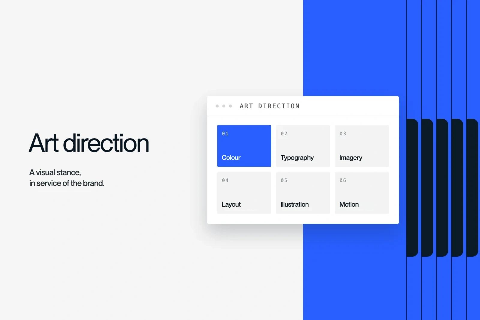
Art direction is the set of visual choices that give a brand a recognisable look: colours, typefaces, images, layout, motion. It turns a strategy into a visual stance, and it sets the course for everyone who produces work for the brand.
Here is what it contains, how it differs from visual identity and brand guidelines, the steps to build it and four examples from our projects.
Explore this post with…
In short: art direction is a stance, not a list of rules: brand guidelines come later, to pin it down. It covers six areas, from colour to motion. Good art direction is recognisable without the logo and can be rolled out without its author. The term also names a job, the art director.
Art direction: the definition
The term covers three things.
- A discipline. The craft of giving an idea a consistent form, for a brand, a website, a campaign or a film.
- A deliverable. The document that sets a project's visual world: mood boards, principles, application examples.
- A job. The art director imagines that world. They make sure designers, photographers, motion designers and developers stay true to it.
In an agency, art direction links strategy and production. It answers one question: what should this brand look like so that its positioning shows?
Art direction, visual identity, brand guidelines: who does what
| Criterion | Art direction | Visual identity | Brand guidelines |
|---|---|---|---|
| Nature | A stance | A system of signs | A user manual |
| Content | Intent, mood, principles | Logo, colours, typefaces, shapes | Usage rules, sizes, don'ts |
| Timing | At the start of the project | Once the art direction is approved | At the end |
| Question | "What look?" | "With which elements?" | "How do we use them?" |
Art direction sets the intent. Visual identity turns it into elements. Brand guidelines explain how to use them. Skipping the first step gives you tidy identities with no character.
What art direction contains
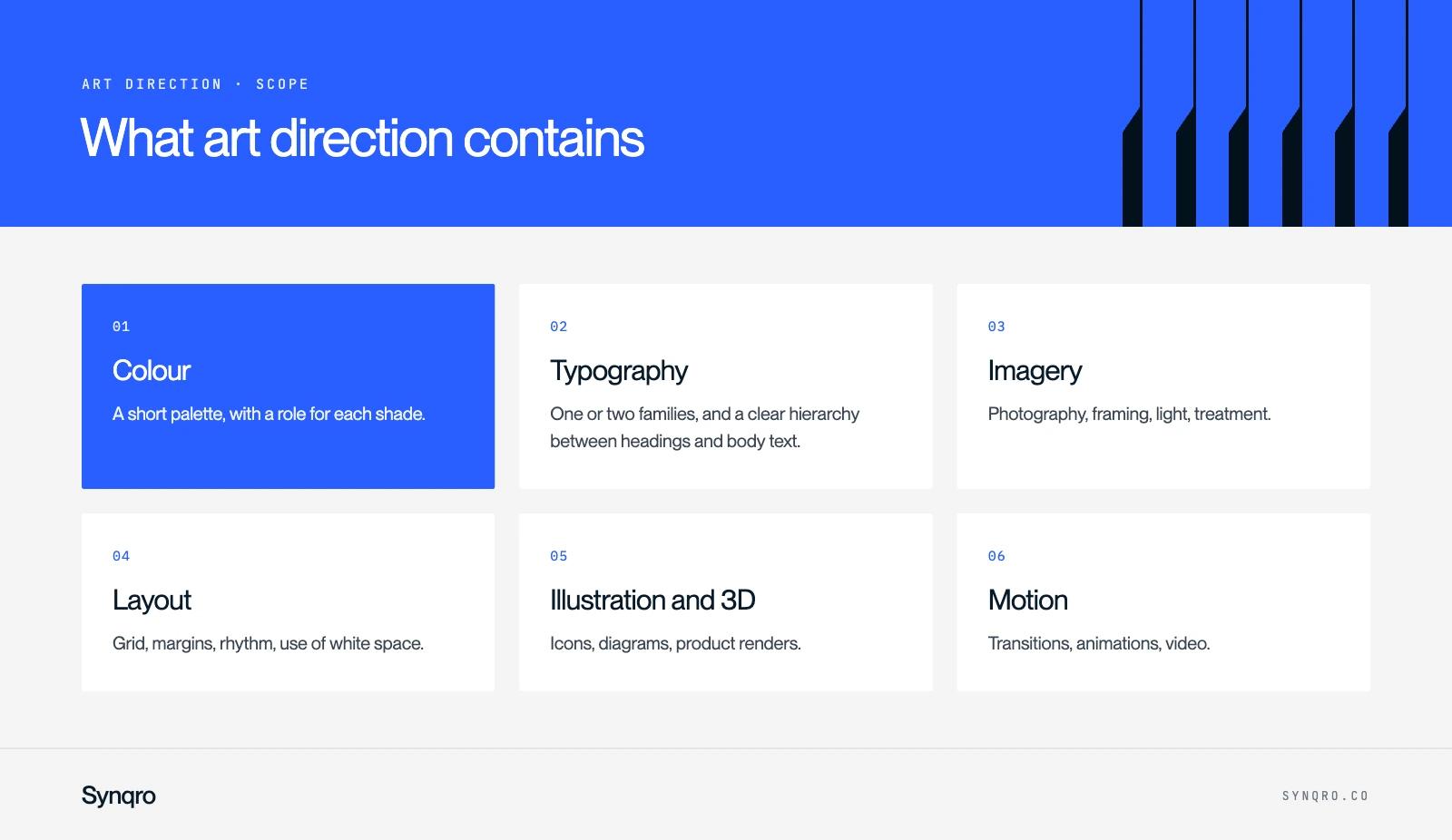
- Colour. A short palette, with a role for each shade. The meaning of colours matters less than using them consistently.
- Typography. One or two families, and a clear hierarchy between headings and body text.
- Imagery. Photography, framing, light, treatment. This is often what dates a brand fastest.
- Layout. Grid, margins, rhythm, use of white space.
- Illustration and 3D. Icons, diagrams, product renders.
- Motion. Transitions, animations, video. On a website, it is as much part of the art direction as colour.
The steps of art direction
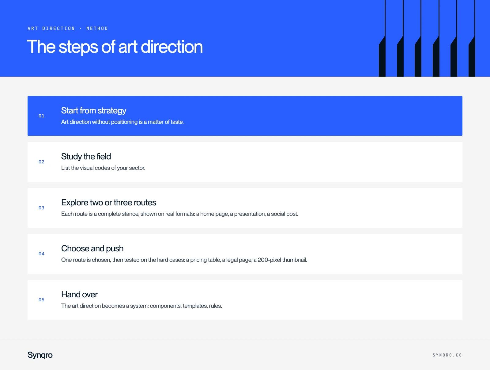
1. Start from strategy
Art direction without positioning is a matter of taste. The brief must say who the brand speaks to, what it promises and who it wants to stand apart from. That is the job of the brand platform.
2. Study the field
List the visual codes of your sector. Then decide which ones to keep to reassure, and which ones to break to get noticed.
3. Explore two or three routes
Each route is a complete stance, shown on real formats: a home page, a presentation, a social post. You judge a look in context, not on a colour chart.
4. Choose and push
One route is chosen, then tested on the hard cases: a pricing table, a legal page, a 200-pixel thumbnail.
5. Hand over
The art direction becomes a system: components, templates, rules. The team must be able to produce without calling the agency for every visual.
Art direction for a website
A website adds constraints a poster ignores: scrolling, screen sizes, load time, content that changes every week. Three rules guide us.
- Content first. The art direction serves what the brand has to show. It does not compete with it.
- Motion has a job. An animation guides the eye or explains. Otherwise, it slows things down.
- Mobile is not a shrunken version. The art direction must hold up there as well as on a large screen.
4 real examples of art direction
La Combine: stepping back to let the work shine
La Combine is a motion design studio. Its brand no longer showed the full range of its craft. The new art direction had to be strong enough to identify the studio at a glance, and restrained enough to give the stage to its projects. The site's animations echo the studio's craft, from timelines to transitions. See the La Combine case study.
Garden Reclaimer: looking established from day one
The company was launching a patented anti-mosquito unit, in a category the public did not know. We defined a clean, reassuring art direction, close to the codes of consumer tech. A new product had to inspire trust immediately. See the Garden Reclaimer case study.
Mocade: luxury codes for a discreet trade
Mocade maintains the carpets and textiles of luxury hotels. The art direction echoes the refinement of the places where the company works, with a crest-shaped logo. Navigation, on the other hand, stays simple. See the Mocade case study.
LM Factory Motors: one colour, one energy
To speak to a new generation of riders, the identity relies on a bold red and a sporty, deliberately aggressive energy. The codes stay premium and clean.
| Brand | Stance | What it serves |
|---|---|---|
| La Combine | Restraint, custom motion | Putting the films first |
| Garden Reclaimer | Clean, close to consumer tech | Reassuring about an unknown product |
| Mocade | Luxury codes, crest | Speaking its clients' language |
| LM Factory Motors | Bold red, sporty energy | Reaching a younger audience |
Four opposite stances, one shared logic: each one follows from a brand goal, not a trend.
Art direction and AI
Generative AI tools produce images in seconds. They do not choose a stance. For Garden Reclaimer, we used AI to create scenes of the unit in gardens, on terraces and in professional spaces. The tool served the art direction, it did not replace it.
Our view: AI makes production cheaper, so direction becomes more valuable. When anyone can generate a beautiful image, the difference lies in choosing the image.
How to judge art direction: 5 questions
- Can you recognise the brand with the logo hidden?
- Do you see the positioning, or just a fashion?
- Does it hold up on a thankless format, like a table or a form?
- Can the team produce on its own without damaging it?
- Does it look like your competitors'? If so, a stance is missing.
When the company changes audience, offer or ambition, the art direction is no longer touched up, it is rebuilt: that is a rebrand. It is the work our branding agency leads, from strategy to website.
Frequently asked questions
Art direction sets the intent and the overall look. Brand guidelines record the usage rules that follow from it. One is designed at the start, the other is written at the end.