Article
Brand Image: definition, examples and how to improve it
Branding8 min read

James BrunettoCo-fondateur & CEO
Brand image is the set of perceptions the public associates with a company: what it thinks of it, what it expects from it and what it says about it when the company is not in the room. It cannot be decreed: it is built at every touchpoint, and it can be measured.
Here is the definition, how it differs from identity and awareness, five simple ways to measure it, the five levers to improve it and three examples from our projects.
Explore this post with…
In short: brand identity is what you send out, brand image is what the public receives. The real issue is the gap between the two: measure it before you fix it. Five levers matter most: positioning, visual identity, website, proof and consistency. A new logo alone does not change an image.
Brand image: the definition
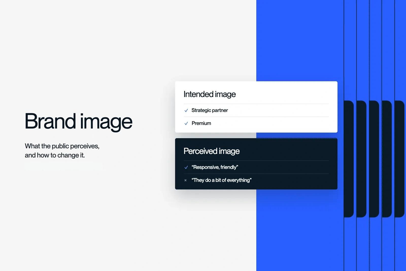
Brand image is the picture a public forms of a brand. It mixes rational elements (price, quality, reliability) and emotional ones (likeability, status, trust).
There are three levels.
- The intended image. What the company wants people to think of it.
- The projected image. What its materials actually say, from the website to the email signature.
- The perceived image. What clients, candidates and prospects remember.
Brand work means narrowing the distance between the first and the third. The second is the only lever you hold.

Image, identity, awareness, reputation: the differences
These four words are often confused. They are not managed the same way.
| Concept | What it is | Who holds it | How to track it |
|---|---|---|---|
| Brand identity | What the brand says and shows about itself | The company | Brand platform, brand guidelines |
| Brand image | What the public perceives | The public | Interviews, reviews, studies |
| Awareness | Whether the brand is known or not | The market | Unaided and aided awareness |
| Reputation | The judgement formed over time | Clients, media, peers | Reviews, press, word of mouth |
A brand can be very well known and poorly perceived. It can also have an excellent image with three hundred people. In B2B, the second case is common, and it is not a problem as long as they are the right people.
To set the identity, the starting point remains the brand platform. The image, on the other hand, is read in other people's minds.
Why a brand image falls behind
An image rarely deteriorates because of a crisis. Most of the time, it simply dates. In the projects we run, four situations keep coming up.
The company grew, its brand did not
Muchbetter trains sales teams with AI. The product was already winning over large accounts, but the identity still showed the company's early days. Its buyers were sales directors at large groups, and a funding round was coming. The image no longer matched the product. After its rebrand, the company raised €4M.
The market puts you in the wrong box
Circul'R helps companies move to the circular economy. It was often seen as a business club, while consulting generates most of its revenue. The perceived image hid the core of the business.
The craft is undervalued
Mocade cares for the carpets and textiles of luxury hotels and restaurants. Its trade was rarely seen as glamorous, while its clients live by the codes of luxury. The gap lay between the brand and its clients' world.
The audience changed
LM Factory Motors equips motorcyclists. The products had proven themselves, but the image had not kept up with an audience that had become younger and more demanding.
In all four cases, the product or service was solid. It was perception that lagged behind. When the gap concerns substance, not only form, it becomes a rebrand.
How to measure your brand image
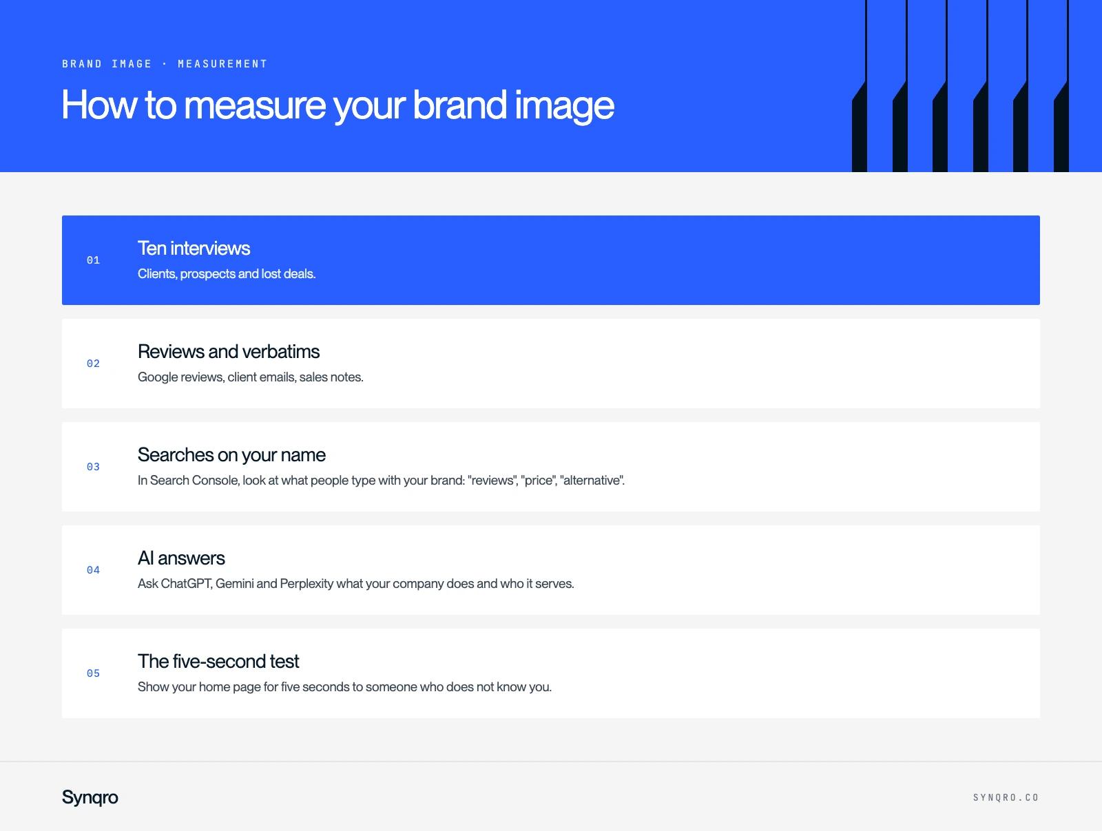
You do not need a big study to start. Five sources are enough for a B2B SME.
- Ten interviews. Clients, prospects and lost deals. One question is enough to open: "If you had to describe us to a peer in three words?"
- Reviews and verbatims. Google reviews, client emails, sales notes. Note the words that recur, not the ratings.
- Searches on your name. In Search Console, look at what people type with your brand: "reviews", "price", "alternative".
- AI answers. Ask ChatGPT, Gemini and Perplexity what your company does and who it serves. Their answer sums up what the web says about you. That is what GEO is all about.
- The five-second test. Show your home page for five seconds to someone who does not know you. Ask them what you sell, and to whom.
Then sort the results in a simple grid.
| What we want to embody | What clients say | Gap |
|---|---|---|
| Strategic partner | "Responsive, friendly" | High |
| Specialist in our sector | "They do a bit of everything" | High |
| Premium | "Good value for money" | Medium |
This example is fictional, but the pattern is common. The rows with a high gap give you the work plan.
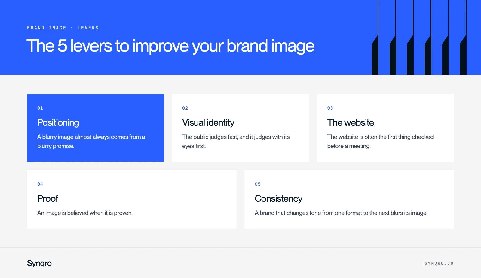
The 5 levers to improve your brand image
1. Positioning
A blurry image almost always comes from a blurry promise. Before touching the visuals, decide: for whom, against what, with what proof. Our brand positioning guide details the method.
2. Visual identity
The public judges fast, and it judges with its eyes first. A dated visual identity casts doubt on an offer that is actually solid. That was Muchbetter's situation with large-group buyers.
3. The website
The website is often the first thing checked before a meeting. It must say the same thing as your sales team, with the same standard.
4. Proof
An image is believed when it is proven. Case studies with figures, reviews, awards, people's names: anything verifiable weighs more than an adjective.
5. Consistency
A brand that changes tone from one format to the next blurs its image. Guidelines that are followed and ready-to-use templates prevent drift.
3 real examples of brand image work
Sleeq: moving beyond the "TikTok agency" label
Sleeq had become the leading TikTok agency in France. Its campaigns already went beyond that single platform, and the company was aiming at the US market. The label was turning into a ceiling.
We rebuilt the brand around a single sign: a badge inspired by the notification dot, both signal and mascot. The palette stays restrained: black, white and Sleeq's neon yellow. The site was designed around case studies. According to the Sleeq case study, revenue tripled less than a year after the relaunch.
Circul'R: from business club to consulting firm
To correct the perception, we reorganised the service hierarchy: consulting first, the club in support. The same message runs through the website, pitch decks and posts. Images stay grounded in reality, with aerial views, to present circularity as a business decision. Qualified leads arrived shortly after launch, as told in the Circul'R case study.
Mocade: speaking its clients' language
Mocade needed a brand that speaks the language of luxury hospitality. We created a crest-shaped logo and an art direction as refined as the places where the company works. The site gives real space to its laboratory and its eco-friendly solutions. The details are in the Mocade case study.
What the three share: the logo is only one piece. It is the whole (message, signs, website, proof) that shifted perception. That is the work our branding agency leads.
The most common mistakes
- Redoing the logo and nothing else. The public does not see a logo, it sees a whole.
- Copying the leader's codes. You strengthen its image, not yours.
- Promising what the experience contradicts. A premium image with a quote sent in ten days does not hold.
- Measuring nothing. Without a starting point, there is no way to know whether the work paid off.
- Changing too often. An image settles over time. Hold your course for several years.
Frequently asked questions
Identity is what the company sends out: its name, values, message and visual signs. Image is what the public retains. Identity is decided, image is observed.