Article
Brochure website examples: 10 Webflow sites analyzed
Webflow10 min read

James BrunettoCo-fondateur & CEO
A brochure website is a website that presents a company, its services and its proof (references, team, contact details) without selling online. Its job is to turn a visit into a contact request, a quote request or a meeting.
This article analyzes 10 brochure website examples, all checked online in October 2026: 5 sites built by Synqro on Webflow and 5 recognized Webflow sites, including 4 winners of the 2025 Webflow Awards. For each one, we describe what the site shows today and what is worth borrowing.
What they have in common: a clear promise on the first screen, concrete proof (logos, case studies, numbers), a single main action and short navigation.
Explore this post with…
What is a brochure website?
A brochure website is a website that presents a business and generates leads, without online payment. It is also called a corporate website or a showcase website. It differs from an e-commerce site, which takes orders.
The usual pages are the home page, one page per offer or service, references, an about page, contact and the legal notice, sometimes with a blog. The number of pages depends on how many services and audiences you need to address, not on a fixed rule.
5 brochure website examples built by Synqro on Webflow
Synqro is a brand, web and visibility agency and a Webflow Premium Partner, founded in 2019, that has worked with more than 150 companies. Here are 5 sites, described as they appear in October 2026.
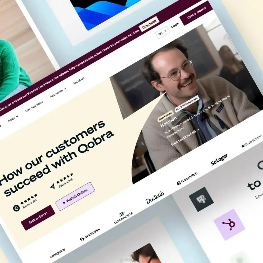
1. Qobra: a B2B SaaS site built around the demo
Qobra makes sales commission management software for RevOps, finance and sales teams. The home page presents five product pillars (automate, design, engage, secure, analyze), AI agents, integrations, a comparison with spreadsheets and customer testimonials.
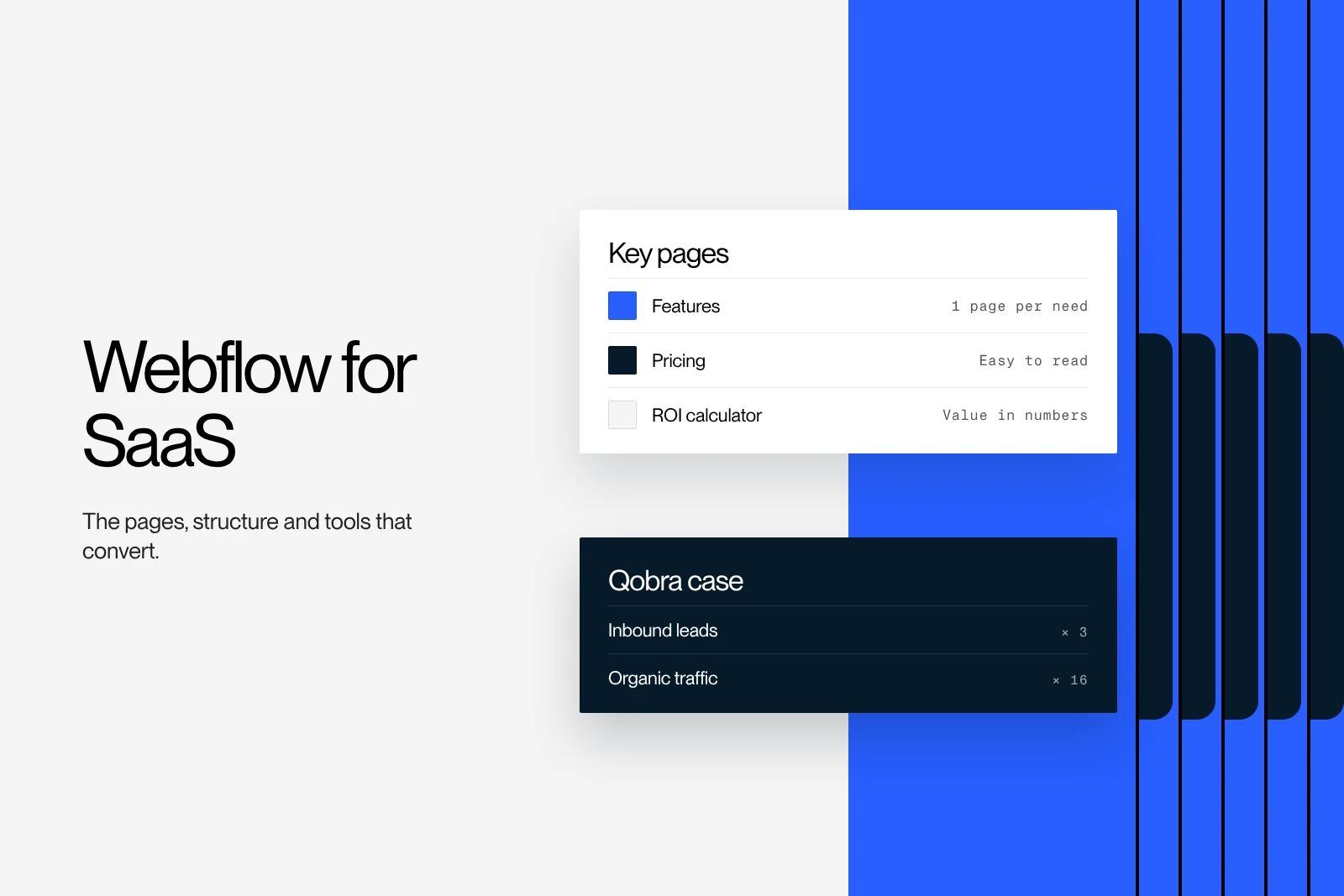
Takeaway: one main action, the demo request, repeated in every section, and dedicated pages for each role. Qobra is also our best-documented client result: leads multiplied by 3 and organic traffic multiplied by 16.
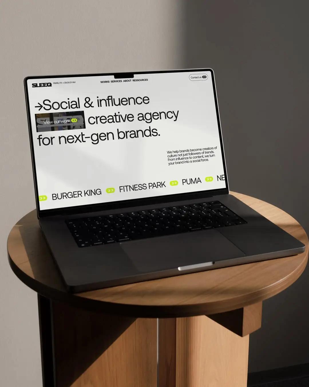
2. Sleeq: an agency site that shows its work before its services
Sleeq is a social media and influencer agency based in Paris (TikTok, Instagram, YouTube). The first screen points to its work. The site then moves through brand case studies, the three offers, testimonials and an FAQ on scope, timelines and pricing.
Takeaway: for a creative provider, case studies convince faster than a list of services. The "Start a project" button leads straight to contact.
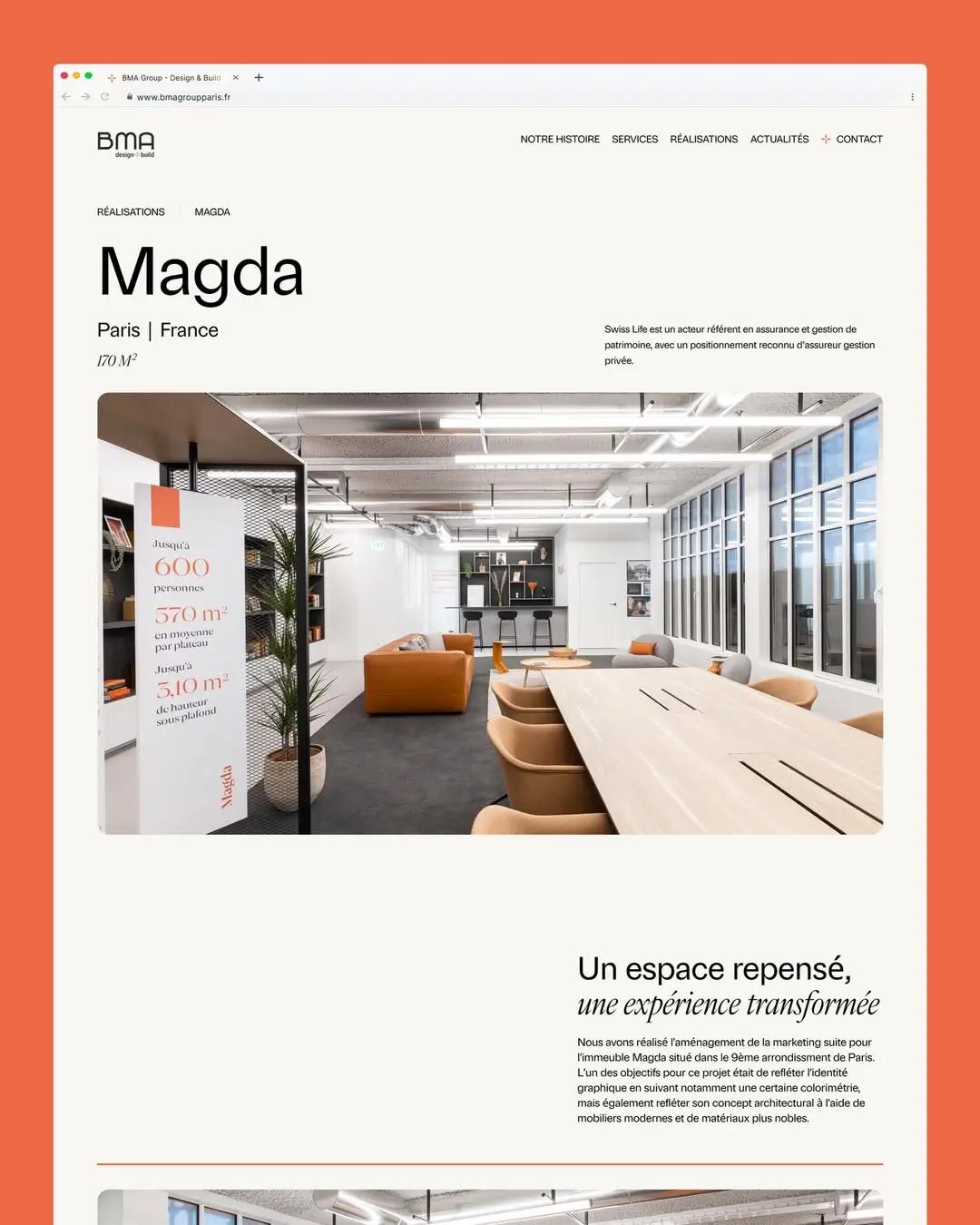
3. BMA Group Paris: a Design & Build offer made easy to read
BMA Group Paris designs and builds workspaces on a Design & Build basis, from consulting to construction. The site splits the offer into four named units (Le Lab, Le Studio, La Prod, La Fab), presents projects with their floor area and answers questions about the stages, site supervision and its CSR approach in an FAQ. It is available in French and English.
Takeaway: when the offer covers several trades, splitting it into units helps visitors find their way. The action offered is "Book a meeting with an expert", more engaging than a generic form.
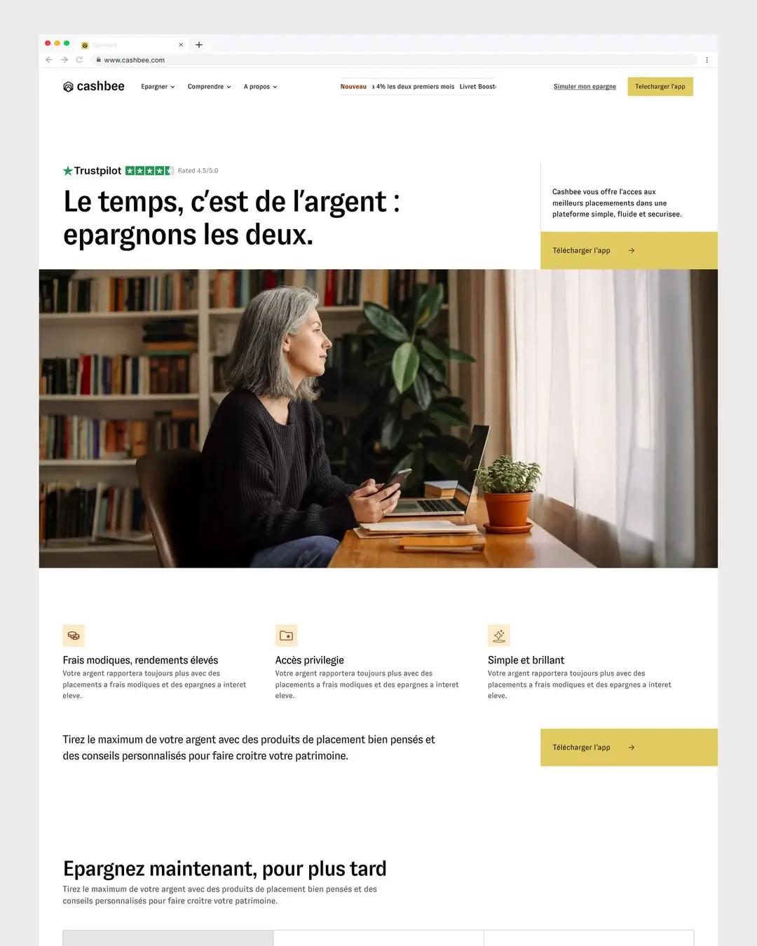
4. Cashbee: reassure before you convert
Cashbee is a French savings and investment platform (savings accounts, life insurance, PER retirement plans, SCPI real estate funds), available as an app and on the web. The site displays its regulatory status, a savings simulator, a help center and booking with an advisor.
Takeaway: in finance, trust comes before visual effect. Visible regulatory information, a simulation tool and human contact remove the obstacles to signing up.
5. Circul'R: a consulting firm that puts numbers on its expertise
Circul'R is a strategy consulting firm specializing in the circular economy. Its home page shows its key figures, eight areas of expertise, three offers (consulting, coalitions, training), client logos, testimonials and an FAQ.
Takeaway: for a consulting firm, business figures and precisely named areas of expertise replace vague promises.
At Synqro, we do not write these pages from generalities. We first collect the client's real data (brochures, figures, cases, objections heard in meetings), then build the site structure and the copy from that material. That is what keeps brochure websites from being interchangeable.
5 Webflow sites to study, including 4 winners of the 2025 Webflow Awards
The Webflow Awards recognize sites built with Webflow every year. The official list of 2025 winners is published on the Webflow blog (page updated on August 20, 2026). These sites are more ambitious than a small business brochure site, but their structural choices carry over.
6. Dropbox brand site (Best Animated Experience)
The Dropbox brand site, designed by the Dropbox Brand Studio, won the Best Animated Experience award. It presents the brand rules: framework, voice and tone, logo, typography, iconography, color, imagery and motion. The animations illustrate each principle instead of decorating the page.
7. Checkout.com (Website Experience of the Year)
The website of Checkout.com, a payment provider, was named Website Experience of the Year, with the agency Flow Ninja. It organizes a very broad offer into five product families and adds industry pages, case studies and an FAQ, with one main action: "Get in touch".
8. Jasper (Brand Transformation of the Year)
Jasper, an AI platform for marketing teams, won Brand Transformation of the Year with the agency OFF+BRAND. The site sorts its solutions by use case, by role and by industry, and offers two actions: a free trial or a demo.
9. Typeform (All Star)
The main website of Typeform, built with the studio MakeBuild, won the All Star award. The home page splits the product into three blocks (forms, lead follow-up automation, research) and pushes a single action: free sign-up.
10. Superglue: a niche B2B SaaS
Superglue is a partner engagement platform for sales teams. Its site, served by the Webflow CDN, moves from a one-sentence promise to ready-made workflows, integrations (Salesforce, HubSpot, Slack), client logos and a demo request. A good model for a software company whose offer fits on one page.
What to take from each example
| Site | Industry | What to borrow |
|---|---|---|
| Qobra | B2B SaaS software | A single repeated action (demo), pages by role |
| Sleeq | Social media agency | Case studies before the list of services |
| BMA Group Paris | Workspace design and fit-out | Offer split into named units, trade-specific FAQ |
| Cashbee | Savings and investment | Visible regulation, simulator, human contact |
| Circul'R | Strategy consulting | Key figures and precise areas of expertise |
| Dropbox (brand site) | Technology | Animations that serve the message |
| Checkout.com | Payments | Broad offer organized into families |
| Jasper | Marketing AI | Navigation by use case, role and industry |
| Typeform | Online forms | Product explained in three blocks |
| Superglue | Niche B2B SaaS | One-sentence promise, visible integrations |
How to analyze a brochure website example for inspiration
Analyzing a brochure website means running it through five criteria: performance, structure, proof, calls to action and SEO. Record your observations in a table, then compare them with your own site.
- Performance. Test the page in PageSpeed Insights. According to Google's web.dev documentation, a good experience means an LCP of 2.5 seconds or less, an INP of 200 ms or less and a CLS of 0.1 or less, measured on 75% of visits. The details are in our guide to Core Web Vitals.
- Structure. Note the menu items and the number of clicks needed to reach an offer or the contact page. Every important offer should be reachable from the main menu.
- Proof. List the logos, case studies, reviews and figures. Useful proof is specific, dated and verifiable.
- Calls to action. Identify the main action. The best examples above have only one, visible on the first screen and repeated at the end of the page.
- SEO. Check the title tag, the meta description, a single H1 and a separate page for each service. The Google Search Central SEO starter guide covers these basics.
Brochure website or e-commerce site: which one to choose?
A brochure website fits when the sale goes through a human conversation: B2B services, independent professionals, tradespeople, consulting firms. An e-commerce site fits when customers can buy on their own, online.
| Criterion | Brochure website | E-commerce site |
|---|---|---|
| Goal | Generate contacts, quotes, meetings | Sell online |
| Main pages | Home, offers, references, contact | Catalog, product pages, cart, checkout |
| Key features | Forms, meeting booking, blog | Inventory management, payment, shipping |
| Measure of success | Qualified leads | Orders and average order value |
| SEO | Service pages and expert content | Product pages, categories, content |
How much does a brochure website on Webflow cost?
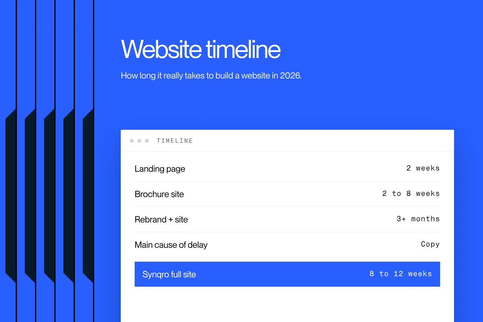
At Synqro, a website costs €3,000 to €20,000 excluding VAT, depending on the design, the brand work, SEO/GEO and any brand overhaul. Allow 8 to 12 weeks for a full site and 2 weeks for a landing page. Market price ranges are detailed in our article on the cost of a brochure website. For the identity side, see our branding agency.
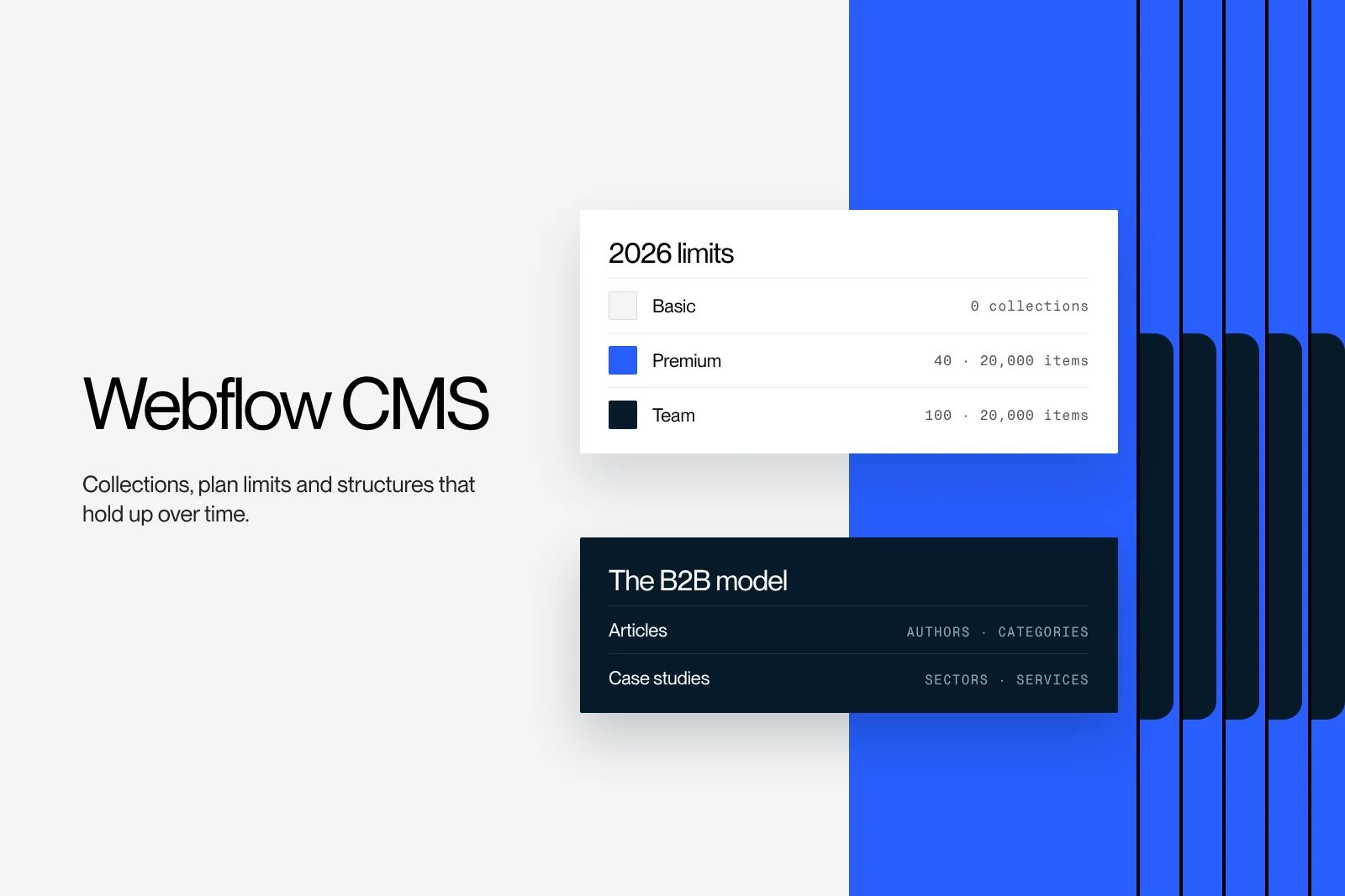
Hosting comes on top. Since the plan overhaul in May 2026, the Webflow pricing page lists three self-serve site plans: Starter (free), Basic at $15 per month and Premium at $25 per month, billed annually. Premium replaces the former CMS and Business plans: it is the plan to budget for if your brochure website has a blog or CMS collections.
5 steps to build a brochure website on Webflow
- Strategy. Define the audiences, the offer, the expected action and the search queries to target.
- Site structure and wireframes. List the pages, then the order of sections on each page.
- Mockup. Design in Figma for desktop and mobile. Our method is detailed in the guide to creating a website mockup.
- Webflow development. Build with a clear class naming convention (Client-First, for example), compressed images and reusable components.
- SEO, GEO and handover. Fill in titles, meta descriptions, structured data and internal links, then train the team to edit the content.
At Synqro, going live is not the end of the project: for clients we support on SEO/GEO, we run a review every quarter to reprioritize pages and content based on real data. To see more projects, browse our Webflow work.
Frequently asked questions
A brochure website is a website that presents a company, its services and its references, without online sales. Its goal is to generate contacts: calls, quote requests or meetings.