Article
Logo redesign: when to do it, and when to walk away
Branding9 min read

James BrunettoCo-fondateur & CEO
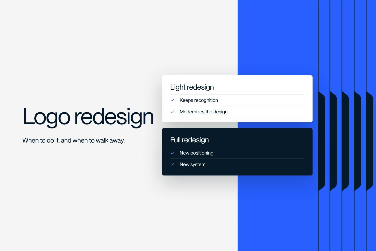
A logo redesign means modifying or replacing a company's graphic mark, from a simple refresh to a completely new symbol. It destroys recognition before it rebuilds it, which makes it an economic decision, not a matter of taste. So the first thing to establish is not what the new logo will look like, but whether the old one really is a problem.
Explore this post with…
Most guides on this topic explain how to run the project. This one starts a step earlier, with the decision itself, because that is where budgets get lost. Synqro is a Webflow Premium Partner offering branding support, and we regularly see redesigns triggered by internal fatigue rather than by a market signal.
The one-question test
Before anything else, answer this: who, outside your company, has complained about your logo?
If the answer is nobody, you do not have a logo problem. You may have a positioning, website, awareness or messaging problem, and none of these is solved by redrawing a symbol. Internal fatigue is the most common trigger for a redesign, and the worst one: you look at your logo a thousand times more often than your customers do.

The question is never what the new brand will look like.
The four signals that justify a redesign
Your business has fundamentally changed. A name or symbol describing work you no longer do becomes misleading. A company whose logo depicts a discontinued product explains its past at every touchpoint.
The logo no longer works technically. This is the strongest reason and the least debated. A logo designed before today's uses becomes unreadable as a favicon, a profile picture, a watermark on a video, or in a single color on printed material. It is not about aesthetics, it is about use.
You are changing your target audience or market. Moving from consumers to B2B, from local to international, or from entry-level to premium changes what the mark needs to signal. In this case the redesign is part of a broader brand project, covered in our article on visual identity.
A legal constraint or a merger requires it. A dispute over prior rights, a business combination, leaving a group. In that case the decision is not yours, only the method is.
The four signals that justify nothing
This is the part guides forget, and it is the one that saves the most money.
A new CEO or a new marketing team. Wanting to mark your arrival is human, but it is not an argument. If the identity works, leaving it in place is good management, not a lack of ambition.
A competitor just redid theirs. You do not know why they did it, or whether it was a good decision. Following a competitor here means letting them set your schedule.
A design trend. Typographic fashions come in waves and return. A logo aligned with the trend of the moment will look dated exactly when that trend ends, and you will pay again.
Sales are dropping. This is the most expensive trap. A logo has never made sales drop and has never made them rise. Looking for the cause elsewhere takes less time than a redesign and costs far less.
What a redesign costs, and what getting it wrong costs
The branding price barometer from La Fabrique du Net (a French agency comparison platform), built on more than 430 budgets actually spent and closed in June 2026, gives a median of €15,000 for a logo, based on 150 budgets, and €30,000 for a full rebrand, based on 78 budgets. The median for a branding project across all services is €10,000.
These amounts are only the visible invoice. The real cost of a redesign includes replacing materials, updating the website, the period when your customers no longer recognize you, and the internal time spent on approvals. Budget generously, and read our breakdown of cost items in the article on the cost of a visual identity.
A redesign this visible is a strategic decision, not a design choice.
The Jaguar case, and what it really shows
Jaguar unveiled its new identity on November 19, 2024: the big cat was dropped in favor of a mostly lowercase wordmark with a capital G, a new palette, two brand marks and a thirty-second film called Copy Nothing. Two weeks later, the Type 00 concept was presented during Miami Art Week. The reaction was immediate and overwhelmingly negative, with Elon Musk publicly asking the brand whether it still sold cars.
The case is cited everywhere as the textbook failed rebrand. The reality is more interesting, and it calls for a word of caution. The sales drop held up as proof of failure reflects a production halt decided before the redesign, while waiting for the new models planned for 2026. Blaming that drop on the logo is a misreading.
What Jaguar really shows lies elsewhere, and it is more useful: the brand deliberately accepted losing its historic customers to go after a different, younger audience with fully electric models. It is a strategic decision, and the logo is only its visible expression. If you are considering a break of this kind, ask yourself the same question they did: are you ready to lose part of your current customers? If the answer is no, you are not looking for a redesign but for a modernization.
Light refresh or full redesign
| Criterion | Modernization | Full redesign |
|---|---|---|
| What changes | Proportions, typography, colors, details | The mark itself, sometimes the name |
| Existing recognition | Preserved | Reset to zero |
| When to choose it | The logo works but has aged | The business, audience or name has changed |
| Materials to update | Gradually, as items are reprinted | All of them, within a short window |
| Main risk | The change goes unnoticed | Losing customers who recognized you |
| Communication needed | Low, a simple switch is enough | High, you need to explain why |
When in doubt, modernization is almost always the right call. It costs less, it preserves what you have built, and it can be repeated every ten years without anyone getting upset.
The method, in five steps
- Write the problem to solve in one sentence. If you cannot, stop there. That sentence will be used to settle every later decision and to cut short debates about taste.
- List every material. Website, signage, vehicles, packaging, contract documents, apps, social accounts. This inventory sets the real budget, often far more than the design work itself.
- Name who decides. One person makes the call, the others give their opinion. This rule prevents projects with twelve rounds of feedback, the number one cause of budget overruns.
- Test in real conditions before approving. As a 16-pixel favicon, in a single color, printed small, embroidered if you have textiles. A logo is approved on real materials, not on a presentation board.
- Deliver with usage guidelines. Clear space, minimum sizes, approved versions, things not to do. Without them, the identity degrades within eighteen months, whatever the budget spent.
At launch, the three classic oversights
Trademark registration. A new logo is not protected by the old registration. Check for prior rights before the design work, not after, and file before any public announcement.
The visual transition. Switching everywhere on the same day is impossible. Decide in advance the order of the switch and which materials will carry both versions for a while, starting with the ones your customers see most.
The website. It is the most visible touchpoint and the one that suffers fastest if the interface rules were not designed with the logo in mind. When a brand redesign leads to a website redesign, both projects should be scoped together, a topic we cover in our guide to website redesign. Color choices deserve the same care, and we explain what is at stake in our article on logo color meaning.
A real example
For Koino, a consulting firm specializing in artificial intelligence, we ran a redesign together with GEO positioning designed to make the firm visible in the answers of AI chatbots. The interesting point for your project is this: the redesign was not a goal in itself, it was the result of a positioning change that had already been decided. That is the right order. The details are in the Koino case study.
If you are torn between modernizing and starting over, or between redoing your logo and redoing your website, we can tell you where to start. Let's talk about your project.
Frequently asked questions
When your business has fundamentally changed, when the logo no longer works technically for today's uses, when you are changing your audience or market, or when a legal constraint requires it. Outside these four cases, the answer is usually no.