Article
Best website designs 2026: 15 award-winning sites analyzed
Webflow17 min read

James BrunettoCo-fondateur & CEO
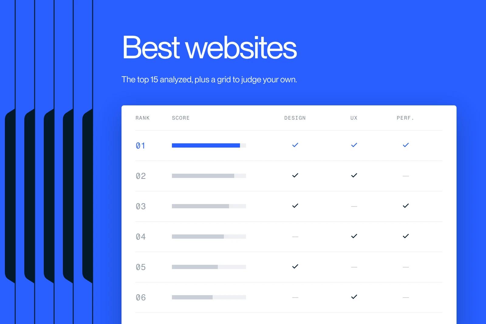
The best website designs of 2026 share two things: a jury singled them out (Awwwards, CSS Design Awards, Webby Awards) and they still hold up in October 2026. We kept 15 of them, opened and checked one by one on October 21, 2026, with the tool behind each when it can be verified: Webflow, Next.js, Astro, WordPress or Three.js. Every site goes through the same six-point grid, which you can run on your own site in five minutes.
Explore this post with…
In short: the 2026 top 15 brings together seven sites awarded between January 2025 and May 2026 (Lando Norris, Awwwards Site of the Year 2025; Dropbox Brand, CSS Design Awards Website of the Year 2025; Igloo Inc, Webby 2026), three French sites we have tracked since 2024, and five global benchmarks the whole market ends up copying (Stripe, Linear, Apple, Notion, Figma). Six of them run on Webflow or Next.js, three on WordPress, one on Astro. What sets them apart is not the visual effect but the consistency: one idea per screen, typography that carries the identity, animation that explains something, and Core Web Vitals in the green. The six-point grid below tells you where your own site stands.
How these 15 sites were chosen
A ranking of websites is only worth something if the websites still exist. So we started by opening every address in our previous selection. Four had disappeared or changed skin since 2024: Spotify Design now redirects to the app, New Story moved to a new domain and design, Repeat was acquired and its site rebuilt, and Swab the World no longer lets our tools in. They are out.
To replace them we went to the source of the most recent juries: the Awwwards Annual Awards 2025, the CSS Design Awards Website of the Year 2025 (results published February 12, 2026) and the 2026 Webby Awards (announced April 21, 2026). Every award cited below was re-read on the jury's own page, not in a third-party article.
Last filter: the tool. When a meta tag or an asset URL gives it away (Webflow, Next.js, Astro, WordPress), we say so. When nothing proves it, we write "custom" rather than guess. If you want galleries to keep browsing, our guide on where to find website inspiration lists the sources we use.
The 15 best website designs of 2026
The table gives the overview. The detailed analyses follow, site by site.
| Site | Sector | Tool | What to take away |
|---|---|---|---|
| Lando Norris | Sports, personal brand | Webflow, WebGL, GSAP | An athlete's site built like a luxury brand |
| Dropbox Brand | Brand guidelines | Webflow | Brand guidelines that read like a product |
| Igloo Inc | Web3, entertainment | Custom | One navigation gesture, held from start to finish |
| Exat Typeface | Type foundry | WordPress (custom theme) | Typography in motion without losing readability |
| Scout Motors | Automotive, e-commerce | Astro | Pre-ordering a vehicle that does not exist yet |
| FOLLOW.ART | Platform, SaaS | Custom | A product explained on one page, built for sign-ups |
| Bruno Simon | Portfolio | Three.js (WebGPU) | The portfolio as a proof of skill |
| Le Trabendo | Concert venue | WordPress | Information you find at a glance |
| Crustac | B2B food industry | WordPress | An industrial message that never contradicts itself |
| Chiara Luzzana | Sound design | Webflow | Sound as a brand dimension |
| Stripe | Fintech | Next.js | A dense bento grid that stays fast |
| Linear | SaaS | Custom | Minimalism that survives redesigns |
| Apple | Product | Custom | One idea per screen, never two |
| Notion | SaaS | Next.js | Hierarchy before decoration |
| Figma | SaaS | Next.js | Saturated color, contrast preserved |
The ten creative choices, analyzed one by one
For each one: what it gets right, what it gives up, and what you can take from it without copying it.
Lando Norris: an athlete's site built like a brand
Awwwards Site of the Year 2025, Site of the Day on November 17, 2025 with a score of 8.18 out of 10, made by OFF+BRAND. The McLaren driver's site does not look like a fan page: it is designed as a brand, with its fluorescent yellow, helmets presented as collector's pieces and a store on its own subdomain.
Navigation is vertical, a "vertical drive" on mobile, and each section answers one simple question: next race, on track, off track, partners. WebGL and GSAP are there, but the page still reads without them. What interests us most: all of this runs on Webflow, proof that an award-winning site does not require a custom framework.
Take away: a two-color palette, repeated everywhere, is enough to make a site recognizable.
Dropbox Brand: brand guidelines that read like a product
Website of the Year 2025 and Best UX Site at the CSS Design Awards, built by Daybreak Studio on Webflow. The site gathers the rules of the Dropbox brand: logo, typography, color, iconography, voice and motion, each topic on its own page.
Its strength is hierarchy: an opening quote, a paragraph of intent, then eight sections named without jargon. You find a rule in two clicks. The site gives up every decorative effect for readability, and it took the UX award on top of the title.
Take away: if your brand has guidelines, publish them as a site, not as a PDF. They will live longer.
Igloo Inc: one navigation gesture, held from start to finish
Awwwards Site of the Year 2024, then a 2026 Webby winner for Best Visual Design (Aesthetic), with abeto and Bureaux in the credits. The site of the parent company of Pudgy Penguins is one continuous 3D scroll, where each section flows into the next without a break.
The Awwwards jury gave it 9.6 out of 10 for animations and transitions, but 6.6 for accessibility and semantics. That is the classic trade-off of immersive sites: spectacular, but fragile on SEO and keyboard use. It earns its place because it is still exemplary two years after launch, which is rare in this category.
Take away: one interaction mechanic, repeated, beats five different effects.
Exat Typeface: typography in motion
Best UI Site at the CSS Design Awards 2025, nominated at the 2026 Webbys, designed by Studio Size and developed by RISE2 Studio on a custom WordPress theme. The site presents Exat, a typeface inspired by the Croatian avant-garde group EXAT 51: 21 styles, 1,715 glyphs per style, and a type tester with weight, width and letter spacing.
The whole site is a demonstration of the typeface, with marquees and animated sequences, yet the body text stays readable. That is the lesson most foundry sites miss: show the font in action without sacrificing reading.
Take away: if your design budget is tight, put it into good typography rather than illustrations.
Scout Motors: pre-ordering a vehicle that does not exist yet
Awwwards E-commerce of the Year 2025, Site of the Day on January 16, 2025, developed by Locomotive on Astro. Scout Motors sells two electric vehicles whose production is targeted for 2027. The site has to convince without a product to deliver.
It does so with a story: the opening video, the 1961 heritage, the launch event, then the two models and a "Reserve now" button repeated at every step. The seven legal disclaimers at the bottom of the page show you can stay transparent without breaking the narrative.
Take away: when the offer is not available yet, the site sells the story and collects purchase intent.
FOLLOW.ART: a product explained on one page
2026 Webby winner for Best Visual Design (Function), made by Vide Infra. FOLLOW.ART gives artists and curators a digital "card" that gathers portfolio, bio, exhibitions and direct financial support.
The home page follows the order you find on the best SaaS pages: a one-sentence promise, a "how it works" video, four numbered benefits, proof (4,000 members in more than 100 countries), then sign-up. No section talks about anything but the product. It is the most restrained site on this list, and one of the most effective.
Take away: on a product page, the order of the sections matters more than their design.
Bruno Simon: the portfolio as a demonstration
Best Portfolio Site at the CSS Design Awards 2025, and already Awwwards Site of the Year in 2019 for its first version. The French developer rebuilt his portfolio in 2025 with Three.js and WebGPU rendering: you drive a small car around a 3D world to discover his projects.
The site does not describe a skill, it performs it. Keyboard, gamepad and mobile controls are documented, graphics quality is adjustable, the source code is public. This choice only suits a creative trade, but it remains the reference of its kind six years after the first version.
Take away: in a creative trade, your site is your first piece of work. It gets judged before the portfolio.
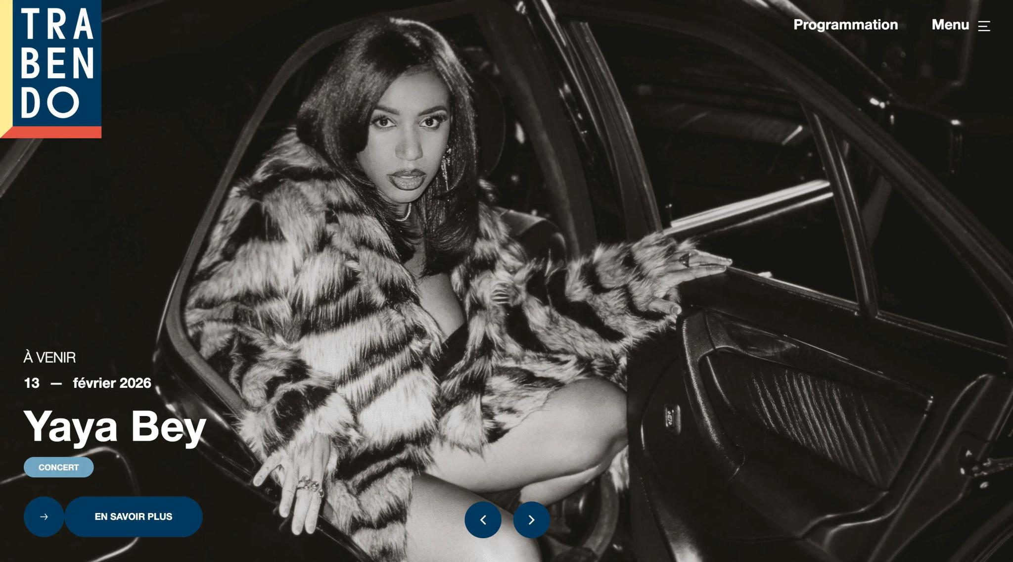
Le Trabendo: information you find at a glance
The site of the concert venue in Paris's Parc de la Villette, built by Contemple Studio on WordPress, was already in our 2024 selection. We reopened it on October 21, 2026: the programme runs through November, the filters by genre and month work, the site is up to date.
A concert venue has one job online: say who plays, when, and where to buy. Le Trabendo embraces that constraint instead of hiding it under effects. Dates dominate the hierarchy, and buying is never more than one click away.
Take away: identify the single action your visitor must be able to take in ten seconds, and build the page around it.
Crustac: an industrial message that never contradicts itself
Crustac, which presents itself as the French leader in private-label seafood, has a WordPress site by SPKTR. Full-screen video on opening, four named production sites, five product ranges, a careers section: every section tells the same story, a serious industry that shows its factories.
The tone, the photos, the palette and the rhythm of the sections never contradict each other. That is the hardest part to copy, because it is decided before design, at the scoping stage. For a B2B site, it is the most transferable example on this list.
Take away: write your promise in one sentence before opening Figma. Every visual decision should trace back to it.
Chiara Luzzana: sound as a brand dimension
Sound designer Chiara Luzzana's portfolio runs on Webflow. The site asks for one click to enable sound, then audio becomes the navigation: each project is heard before it is read.
It is one of the rare cases where audio is a design decision rather than a gimmick, because the work on show is sound. The site does ask you to turn your phone to landscape, a deliberate sacrifice of mobile comfort.
Take away: an extra sensory dimension is only justified if it demonstrates your craft.
The five global benchmarks to study alongside
These five sites do not compete for awards, but they set the standards the rest of the market adopts eighteen months later. All five were reopened on October 21, 2026.
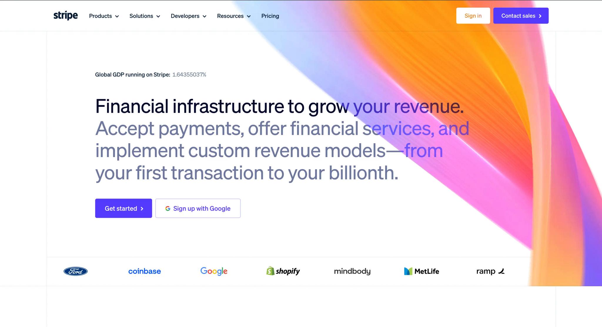
- Stripe (Next.js): the home page is a bento grid of products, a scrolling band of logos, dated figures (2025 volume, 99.999% uptime), with A/B tests run at the edge. The visual effect is concentrated on the hero gradient; the rest of the page is restrained and fast.
- Linear: a near-black dark theme, product screenshots instead of illustrations, a changelog dated October 2026 on the home page. The minimalism has held for years without a visible redesign: a coherent design system ages better than a well-executed trend.
- Apple: full-width tiles stacked one after another, an image, a tagline, two buttons, then the next product. One idea per screen, taken all the way.
- Notion (Next.js, content served from Contentful): a video behind the hero, a monochrome logo wall, three pillars named with a verb (Capture, Find, Automate). The page scans in two seconds.
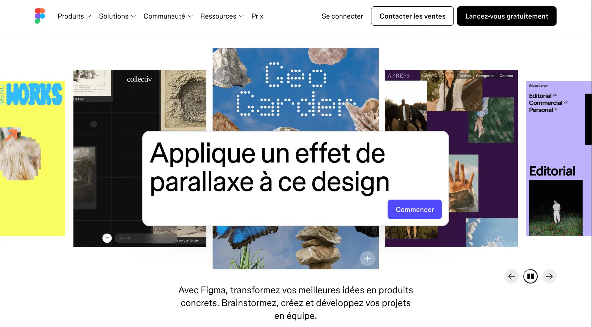
- Figma (Next.js): the home page moved from colorful neo-brutalism to a white canvas with product mockups, but the purple, pink and teal accents remain and the contrast stays readable. Dare to use color without losing legibility.
The contrast between these five industrial systems and the ten creative choices above is what trains the eye. For the theory, our web design guide covers hierarchy, grids and typography.
The six-point grid to score your own site
All fifteen sites above went through the same grid. You can run it on your own site in five minutes, and every tool mentioned is free. The performance thresholds are Google's published Core Web Vitals, measured at the 75th percentile of real visits.
| Criterion | What we look at | How to test it |
|---|---|---|
| Design | Visual consistency, hierarchy, rhythm of the sections | Squint at the page: if the reading order disappears, the hierarchy has failed |
| UX | Intuitive navigation, logical architecture, accessibility | Navigate with the keyboard only, Tab key. If you lose focus, accessibility needs work |
| Performance | LCP under 2.5 s, INP under 200 ms, CLS under 0.1 | PageSpeed Insights, reading field data rather than the lab score |
| SEO | Semantic markup, structured data, internal linking | Google's Rich Results Test, then view source to check there is a single H1 |
| Responsive | Mobile adaptation with no loss of experience | DevTools at 360 px wide: if anything overflows horizontally, it fails |
| Identity | A stance that holds 3 to 5 years without looking dated | Hide the logo. If the site could belong to three competitors, the identity is too weak |
A good site ticks at least four criteria. A remarkable one ticks all six, and there are fewer of those than you think: Igloo Inc, cited above, loses points on SEO and accessibility despite its two awards. The most neglected criterion is the last one. In our audits, the hidden-logo test eliminates half the sites people cite to us as references.
Web design trends 2026, as seen in these 15 sites
We only kept the trends visible in the selection, not the ones from forecasting reports.
- The bento grid, now standard: Stripe and Apple use it to present several products without stacking sections. One feature per cell, scannable on mobile.
- Typography as the interface: Exat, Lando Norris and Dropbox Brand carry their identity through type more than illustration. Variable fonts let you animate weight and width without loading several files.
- Continuous 3D scrolling, reserved for brands that can afford it: Igloo Inc and Bruno Simon do it well, at the cost of low accessibility scores. For a B2B site, concentrate the effect on a single screen, as Stripe does.
- Dark by default: Linear, Lando Norris and Igloo Inc open on a near-black background. Switching with system preferences is now expected rather than noticed.
- Pages built around a single action: Scout Motors (reserve), FOLLOW.ART (create your card), Le Trabendo (buy a ticket). The button returns in every section, and the rest of the page justifies it.
- Dated figures as proof: Stripe shows its 2025 volume, FOLLOW.ART its 4,000 members, Figma its Fortune 500 adoption dated March 2025. An undated figure no longer convinces anyone.
The trend we advise against: WebGL across the whole page. Impressive for thirty seconds, tiring after three minutes, expensive to maintain, and penalizing on the SEO and accessibility criteria of the grid.
What Synqro keeps for its own projects
We benchmark this kind of site to feed our briefs, not to copy them. Three rules come out of it, applied on every project since 2019 and more than 150 companies.
- The promise before the design. Crustac, Scout Motors and FOLLOW.ART hold together because the message was written before the mockup. That is what our scoping workshop is for: sitemap and copy first, component-based design in Figma next, Webflow build last.
- Concentrated effect, not generalized. Like Stripe or Lando Norris, we save animation for one strong moment and keep the rest of the page fast. The site is hosted on Webflow, with no plugins to maintain, which makes Core Web Vitals reachable without acrobatics.
- The site has to produce something. An award-winning site that generates neither leads nor traffic is still a cost. We measure before and after.
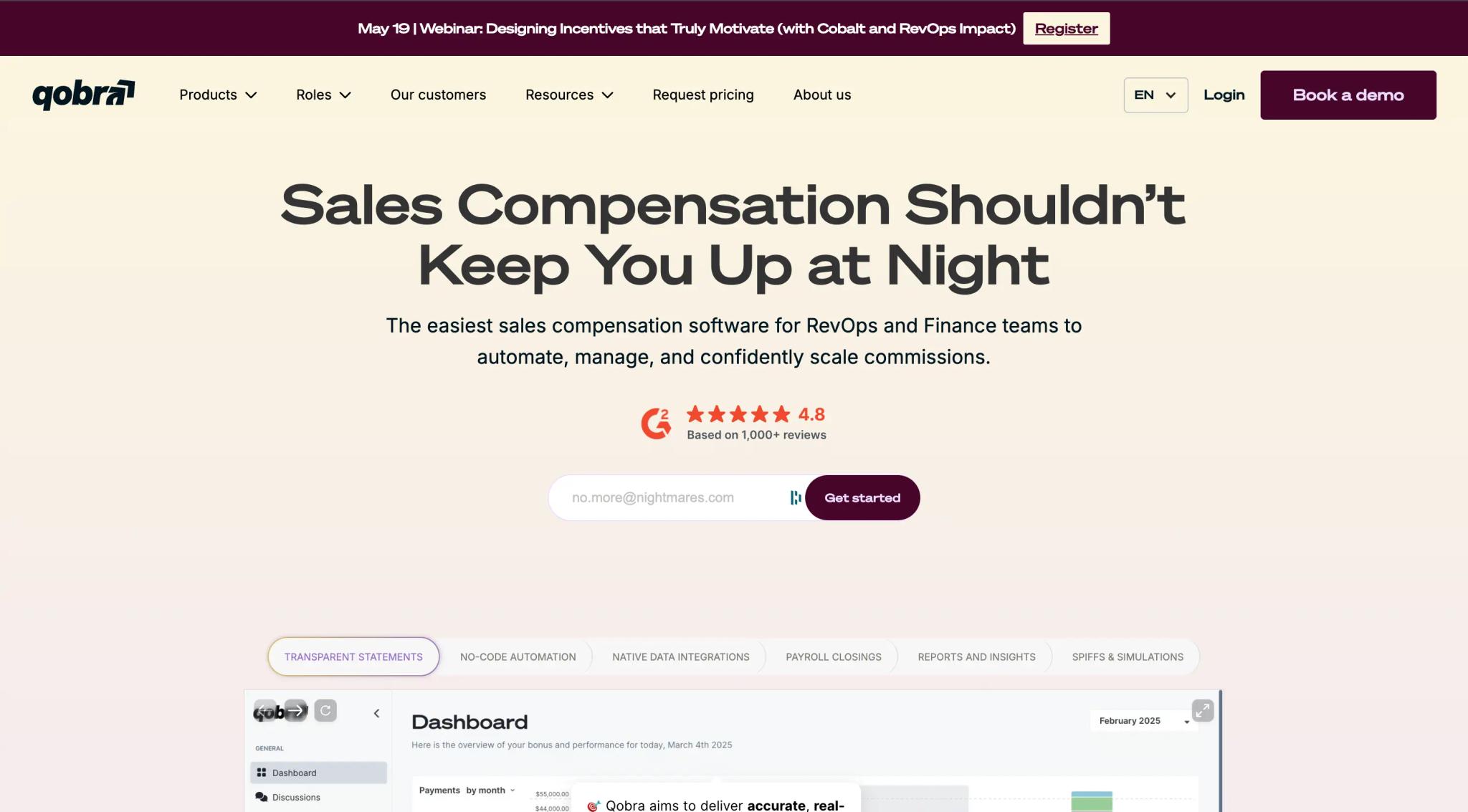
Two projects illustrate this method. For Qobra, a sales commission platform, we built the Webflow site that accompanied its rebranding, then optimized it for two years: ROI calculator, funnels per audience, pages for the launch of its AI features. Result: three times more inbound requests and sixteen times more organic traffic.
For Sleeq, a TikTok agency turned global influence agency, we rebuilt the brand around a badge inspired by the notification dot, then designed the site around the case studies, so that each project works as a sales argument. It is the Le Trabendo approach applied to an agency: the site lets the work speak.
This work has earned Synqro three Awwwards honorable mentions and second place in the Mekaa 2026 ranking of branding agencies. If your project combines a site and an identity, our branding agency page covers the brand side; for the build itself, see our Webflow agency page, with Webflow Premium Partner status, the highest tier of the Webflow partner program.
Frequently asked questions
The seven award-winning sites in our selection are Lando Norris (Awwwards Site of the Year 2025), Dropbox Brand (CSS Design Awards Website of the Year 2025), Igloo Inc (Webby 2026), Exat Typeface, Scout Motors, FOLLOW.ART and Bruno Simon, completed by three verified French sites: Le Trabendo, Crustac and Chiara Luzzana.
Alongside them, five global benchmarks set the standards: Stripe, Linear, Apple, Notion and Figma. All were reopened on October 21, 2026.