Article
Lazy loading images: when to use it, when to avoid it
SEO10 min read

James BrunettoCo-fondateur & CEO
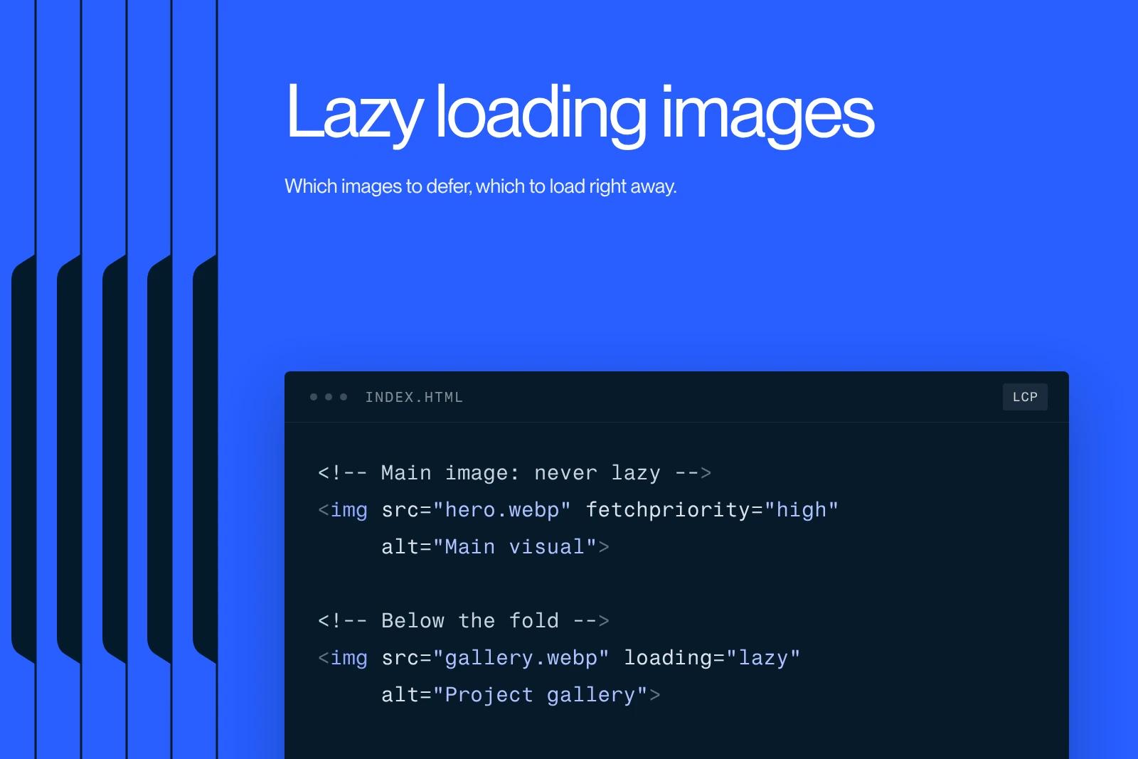
Lazy loading images is a setting that tells the browser to download an image only when it gets close to the screen, instead of loading it with the rest of the page. In HTML, it comes down to one attribute: loading="lazy". Set correctly, it makes long pages lighter. Set badly, it delays the display of the main content and hurts the metric Google looks at. Here is the rule for deciding, and the cases where you should leave it off.
Explore this post with…
The rule in one sentence
Defer generously everything that is far from the screen, never what is visible when the page opens. That is the conclusion of the study published on web.dev by Felix Arntz and Rick Viscomi on March 31, 2022, and it has not changed since. Their measurement on HTTP Archive data is the one thing to remember if you read nothing else: the median LCP of pages that use lazy loading was 3,546 ms, compared with 2,922 ms for pages that do not. That is 621 ms slower, on pages that are supposed to be faster.
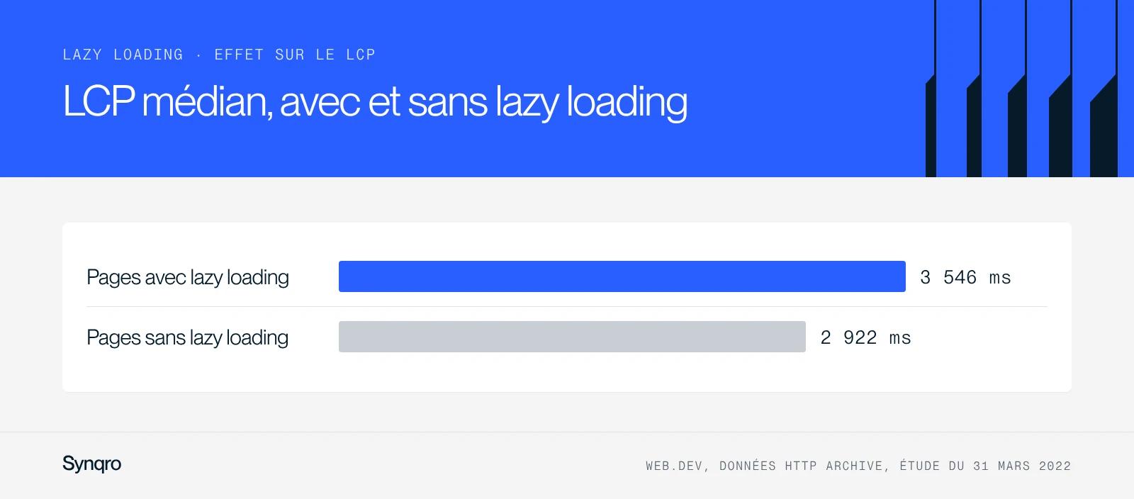
The cause is simple. Lazy loading does not sort the images for you. Applied without a decision, it also hits the image that fills the first screen, the one that triggers the Largest Contentful Paint. The browser then has to work out where the image sits before deciding to download it, which adds a round trip where none was needed.
How many sites shoot themselves in the foot
The HTTP Archive Web Almanac 2025 puts a number on the problem. Between 16% and 17% of pages apply lazy loading to their own LCP image. In detail, 10.4% of mobile pages and 11.5% of desktop pages set the native attribute on that element, and 5.9% of mobile pages use a custom approach of the data-src type.
The same report is a reminder of why the stakes are concentrated on images: 85.3% of desktop pages and 76% of mobile pages have an image as their LCP element. On the vast majority of sites, perceived speed therefore depends on a single visual, and one page in six makes it wait on purpose.
On the other side, the attribute designed to speed up that image is still rarely used: fetchpriority="high" is present on only 16.3% of desktop pages and 17.3% of mobile pages, up two points from 2024.
What the loading attribute actually does
It accepts two values. lazy postpones the download until the resource reaches a calculated distance from the viewport. eager is the browser's default behavior: the image is requested immediately, wherever it sits on the page.
The trigger distance is not the fold, contrary to what you often read. Chrome anticipates: about 1,250 px on a 4G connection, about 2,500 px on 3G or slower. The browser therefore starts loading well before the image enters the screen, which explains why the visible gain is often smaller than hoped on a short page.
On the support side, the web.dev documentation updated on August 13, 2024 lists Chrome 77 and later, Edge 79, Firefox 75 and Safari 15.4. The compatibility question is settled. There is no longer any reason to load a JavaScript library to do this job.
Two limits to know. The attribute only works on img and iframe tags: a background image declared in CSS escapes it completely. And you need to set width and height on every image, otherwise the browser does not reserve the space and the page jumps when the image arrives, which hurts Cumulative Layout Shift.
Which images to defer, which images to load right away
The decision is made image by image, looking at the page in phone format rather than on a wide screen. Here is the grid we apply in audits.
| Image | Setting | Why |
|---|---|---|
| Main visual of the first screen | loading="eager" and fetchpriority="high" | It is almost always the LCP element. Deferring it delays the metric itself. |
| Logo and header icons | loading="eager" | Visible as soon as the page opens, negligible weight, nothing to gain by deferring them. |
| Visuals on the second screen | eager if the content moves up on mobile | A visual below the fold on desktop often ends up above it on mobile. |
| Illustrations in the body of an article | loading="lazy" | The ideal case: far from the viewport, and often never reached by some visitors. |
| Galleries and carousels beyond the first view | loading="lazy" | Real bandwidth savings, no effect on LCP. |
| Paginated CMS grids | lazy, except the first two or three thumbnails | The first thumbnails can be the LCP on a listing page. |
| CSS background images | the attribute does not apply | The loading attribute only works on img tags. Another treatment is needed. |
The most common trap is the one in the third row. A visual placed to the right of a text block on desktop ends up stacked under that text on mobile, or the other way around. The correct setting on desktop then becomes a wrong setting on mobile, and it is the mobile version that counts in the measurement.
What Google asks for on the indexing side
The Google Search Central documentation on lazy-loaded content, updated on December 10, 2025, sets one core requirement: your implementation must load all relevant content whenever it is visible in the viewport. Google explicitly recognizes three methods: the browser's native lazy loading, the IntersectionObserver API, and libraries that load content as it enters the viewport.
The constraint that makes custom implementations fail fits in one sentence: Google Search does not interact with the page, it neither scrolls nor clicks. Loading triggered by a user action, a "see more" button or an actual scroll, will never be reached by the crawler.
To check, Google points to the URL Inspection tool in Search Console: look at the rendered HTML and confirm that the image URLs do appear in the src attribute of the img tags. It is a three-minute check, to be done once per page template rather than once per page. It belongs in any serious technical SEO audit.
A useful detail on infinite scroll: Google asks for a unique, stable URL for each chunk of content, with an absolute page number such as ?page=12, and sequential links between those URLs. A page that stacks its results without ever changing URL exposes only one document to indexing.
The Webflow case
Webflow has applied lazy loading by default to every new image since an update released on August 27, 2020. That switch did not affect images already in place on existing sites, and the setting is changed image by image in the settings panel.
The practical consequence on a Webflow project is counterintuitive: the job is not to turn lazy loading on, it is already on. The job is to turn it off on the first-screen visual of each page template. On a CMS site, that means the article template, the listing page template, the home page and the service pages. Five to ten fixes, no more, for a gain you can read directly in PageSpeed Insights.
The setting does not cover background images set through styles. On a site heavy with background visuals, the trade-off shifts to file weight and format, a topic covered in our guide to images and SEO and in our SEO optimization steps for Webflow.
What it changes on a real project
For Les Fermes de Marie, a luxury hotel in Megève, we ran an SEO audit that led to more than 50 technical fixes. On this kind of site, where the visual carries the commercial promise, the image loading setting is not a developer detail. It is the difference between a home page that displays before the visitor gives up and a page that displays after. Synqro is a Webflow Premium Partner agency, and this check is part of our standard deliveries.
The four mistakes that keep coming back
Deferring everything on principle. This is the most frequent case, and the one the Web Almanac measures. Lazy loading is not an optimization you add, it is a decision you make.
Forgetting width and height. The weight saving is real, CLS gets worse, and the net result is negative. These two attributes cost ten seconds per image.
Stacking a JavaScript library on top of the native attribute. The two mechanisms get in each other's way, and the script adds work to the main thread. Since Safari 15.4, native is enough.
Setting it up on desktop and never checking on mobile. The first mobile screen almost always contains more images, relative to its height, than the first desktop screen.
The check, in three steps
Open PageSpeed Insights on the page and note which element is identified as the LCP. Open the code of that element and check that it does not carry loading="lazy". If Lighthouse flags the audit on a lazy-loaded LCP image, you have the answer without searching.
Then run the URL through the inspection tool in Search Console and read the rendered HTML: every image in the body must have a real src. Finally, run the test again while simulating a phone screen, because that is the version Google indexes.
For reference, the Core Web Vitals thresholds at the 75th percentile, as defined by the Chrome team and updated on May 7, 2025: LCP is good up to 2,500 ms, needs improvement between 2,500 and 4,000 ms, and is poor beyond that. INP is good up to 200 ms. CLS is good up to 0.1.
Going further
Image loading is one of the few jobs where half a day of work shows up directly in the measurement. If you want this check done on your site and built into your page templates rather than redone at every publication, our Webflow SEO agency takes care of it, and our team of Webflow experts works directly in the Designer. Let's talk about your project.
Frequently asked questions
No, as long as the image ends up in the rendered code of the page. Google documents the methods it can follow, the native attribute and the IntersectionObserver API, and points out that Search does not interact with the page: it neither scrolls nor clicks. An image that only appears after an actual scroll will never be seen.