Article
Brand guidelines: what to include, a real example and cost
Branding11 min read

James BrunettoCo-fondateur & CEO
Brand guidelines are the document that sets the rules for using a brand's visual identity: logo, colours, typefaces, imagery and layouts. They let anyone, in-house or at a supplier, produce consistent material without going back to the designer every time. Here is what they contain, Synqro's own guidelines walked through page by page with the real values, the web rules most guidelines forget, what they cost and an outline you can reuse.
Explore this post with…
In short: brand guidelines do not create the identity, they make it usable. They run to 15 to 40 pages, take ten minutes to read and must pass one test: could a designer who has never met you produce the right visual with this document alone? In France, La Fabrique du Net reports a median of €15,000 for brand guidelines produced by a branding agency.
Brand guidelines: the definition
Brand guidelines, sometimes called a brand book or style guide, are the user manual of your visual identity. They list the elements that exist (the logo and its versions, the palette, the typefaces, the image style) and above all how to use them: sizes, spacing, allowed and forbidden combinations.
They do not replace creative work. They come after it. First you decide what the brand should express, then you design the assets, then you write the rules that protect them. That third step is the guidelines.
Good guidelines have two readers. Your marketing team, who open them to check a detail before publishing. And your suppliers, who receive them on day one of a project: printer, events agency, web developer. If the document is only ever shown at a board meeting, it has missed its audience.
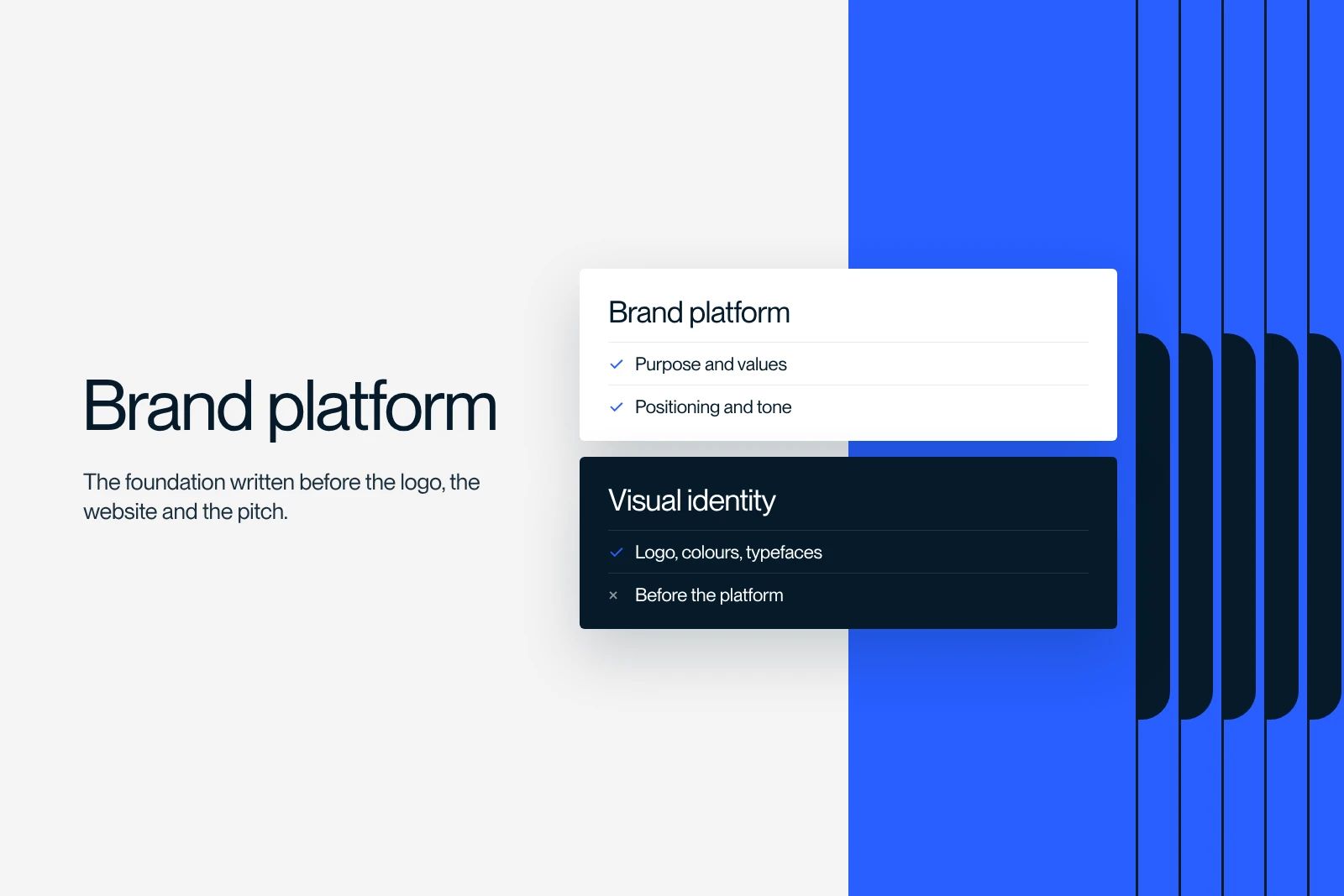
Brand guidelines, visual identity, brand platform: who does what
The three terms are often mixed up. They describe different things, produced at different moments.
| Document | What it sets | The question it answers | When |
|---|---|---|---|
| Brand platform | Purpose, positioning, promise, tone | What does the brand say, and why? | First |
| Visual identity | Logo, colours, typefaces, graphic world | What does the brand look like? | Next |
| Brand guidelines | Rules for using the visual identity | How do we use it without betraying it? | Last |
The brand platform is the substance. The visual identity is the form. Brand guidelines are the highway code that keeps the form true to the substance, one asset after another.
What brand guidelines should include
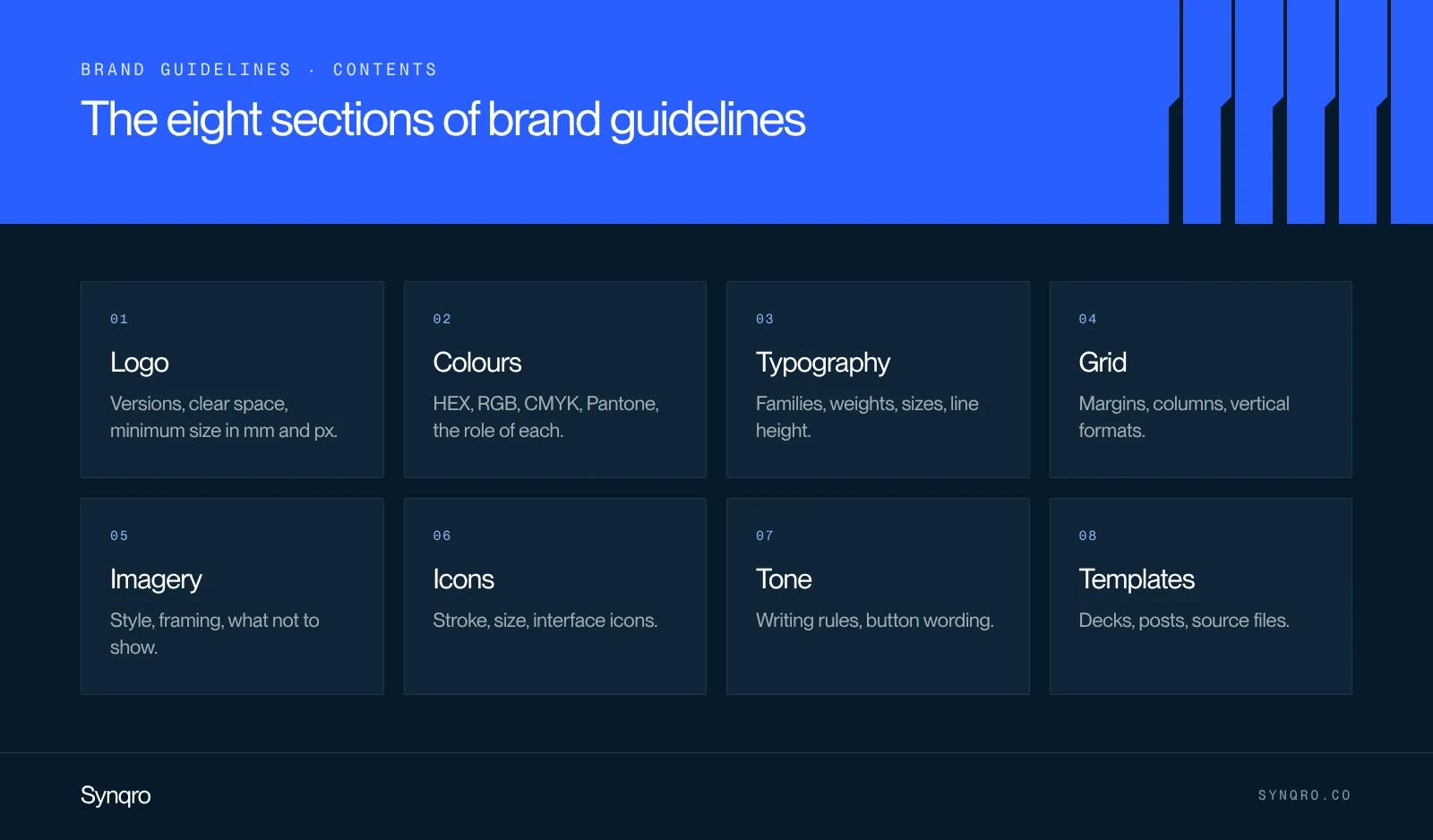
Content varies with the size of the brand, but eight sections appear in every set of guidelines that actually gets used. For each one, the table shows what to specify and the omission we see most often when a company sends us its existing guidelines.
| Section | What to specify | Common omission |
|---|---|---|
| Logo | Versions (primary, horizontal, symbol), clear space, minimum size, allowed backgrounds | Minimum size in pixels for screens |
| Colours | HEX, RGB, CMYK and Pantone values, role of each colour, proportions | Forbidden pairings for contrast |
| Typography | Families, weights, sizes, line height, fallback font | Web licence and the fallback font for emails |
| Grid and layout | Margins, columns, alignment | Vertical social media formats |
| Imagery | Photo style, framing, treatment, approved stock libraries | What must not be shown |
| Icons | Stroke style, size, grid | The site's interface icons |
| Tone and microcopy | A few writing rules, before and after examples | Button and form wording |
| Templates | Decks, stationery, email signature, social posts | Editable source files |
Two notes. A tone section may look out of place in a visual document. We keep it because a badly worded button damages a page as surely as a wrong colour. And templates are the most used part of any guidelines: they are how the rules get applied day to day, without anyone having to reread them.
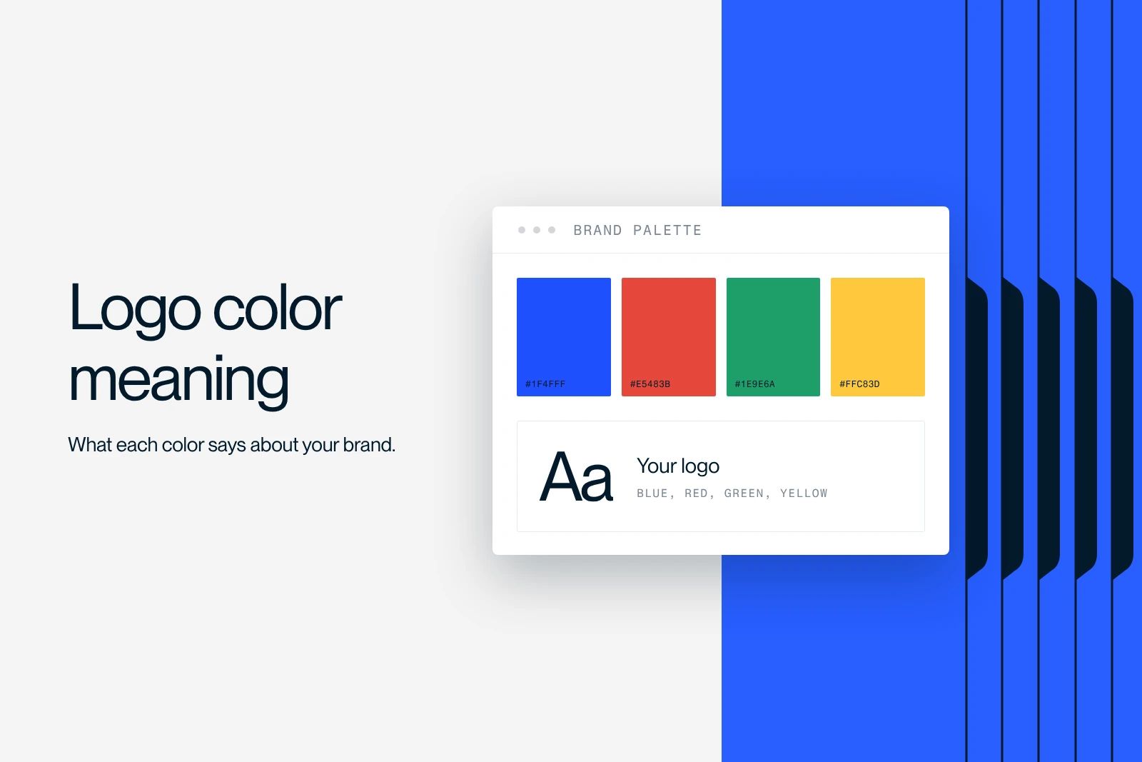
Each colour choice is made upstream, from the brand's personality. We cover that step in our guide to logo colour meaning.
Example: Synqro's brand guidelines, page by page
Big brands' guidelines circulate as PDFs, but they describe organisations of thousands of people. For a smaller company, the most useful example is short and real. So here are ours, with the exact values used on synqro.co, taken from the site's code in October 2026.
The logo
A symbol of three striped bars, followed by the word Synqro. It comes in black on light backgrounds and white on dark ones, never blue on blue. On the site it ships as an SVG that inherits the text colour (currentColor), so one file displays in black or white depending on the background. Its reference height in the desktop header is 21 px.
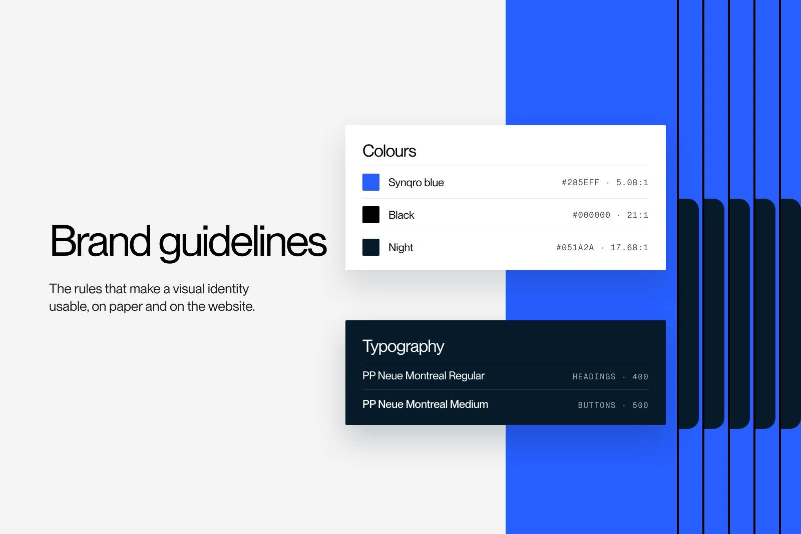
The colours
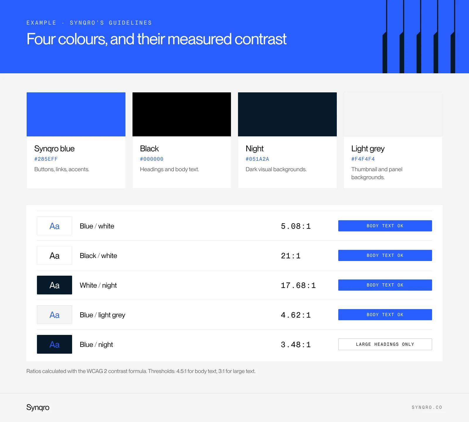
Four colours only, each with a job.
| Colour | Value | Role | Measured contrast |
|---|---|---|---|
| Synqro blue | #285EFF | Buttons, links, accents, never body text on a dark background | 5.08:1 on white |
| Black | #000000 | Headings and body text | 21:1 on white |
| Night | #051A2A | Dark visual backgrounds | 17.68:1 with white |
| Light grey | #F4F4F4 | Thumbnail and panel backgrounds | Background only, no light text on it |
The last column is almost never in brand guidelines. It should be. We calculated it with the WCAG contrast formula, the web accessibility standard, and it taught us something: our blue on our night background only reaches 3.48:1. That is enough for a large heading (the threshold is 3:1) but not for a paragraph (4.5:1). So the rule is written down: on a night background, body text is white, and blue is reserved for large elements.
The typography
One family, PP Neue Montreal, in two weights: Regular (400) for headings and text, Medium (500) for buttons and small labels. The site only loads those two files, which matters for speed.
| Element | Size | Weight | Line height | Letter spacing |
|---|---|---|---|---|
| Home heading | 67.8 px | 400 | 1.1 | -0.32 px |
| Body text | 16 px | 400 | 1.4 | -0.32 px |
| Button | 14 px | 500 | 17 px | normal |
Headings in Regular rather than bold, slightly tight letter spacing: that is what gives the site its calm tone. Guidelines that just say "PP Neue Montreal" without these settings leave every supplier to reinvent the hierarchy, and that is where consistency is lost.
Shapes and spirit
2 px corners, never large rounding. No gradients. One blue accent per screen. Plenty of white space. Those four lines fit on one page and rule out half of the off-brand visuals we see.
That is all. A small company's guidelines do not need a hundred pages. They need precise values and a few clear don'ts.
The web rules most brand guidelines forget
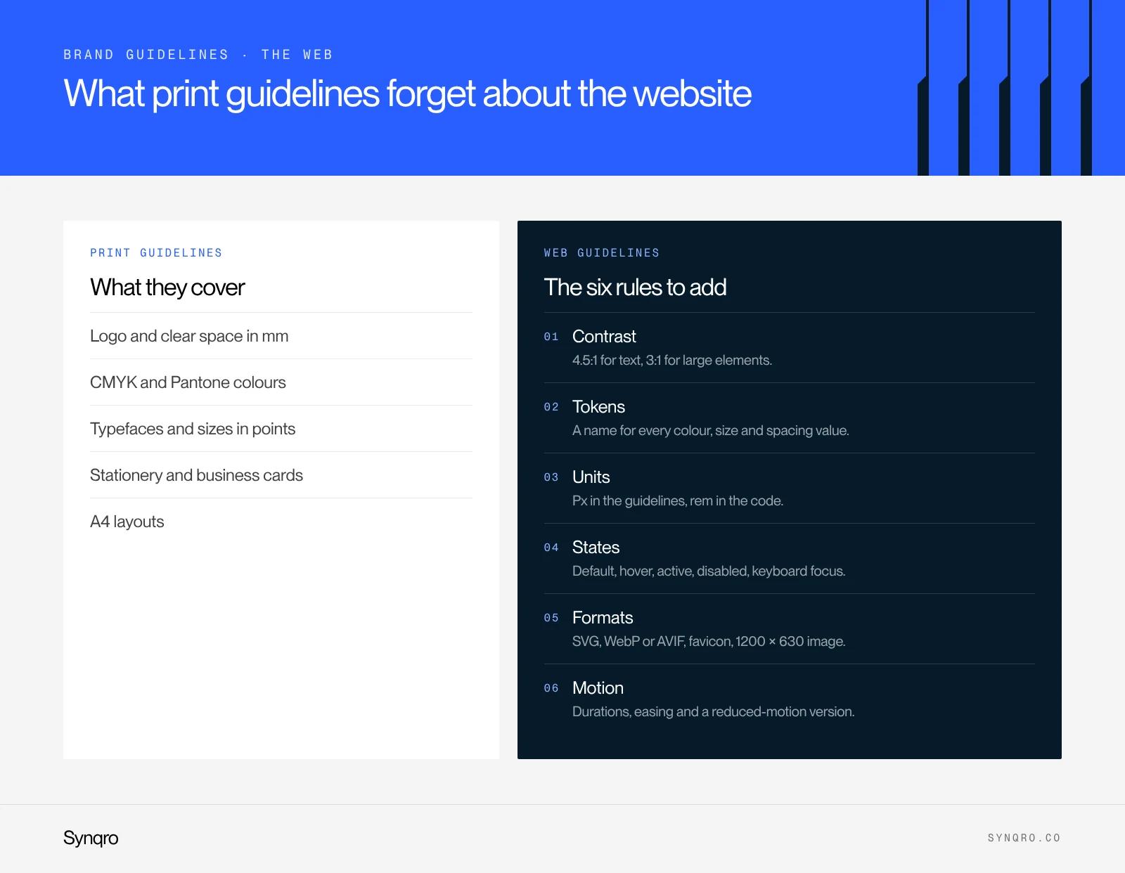
Many guidelines are still designed for print, then stretched to the web. The website ends up as the least governed channel, even though it is often the first one clients see. Here is what we always add.
- Contrast. WCAG asks for 4.5:1 for body text and 3:1 for large text and interface elements. State, for each colour, what it can be paired with. Our guide to web accessibility covers the obligations.
- Tokens. Every colour, size and spacing value gets a name (for example color-accent, text-body). The developer reuses them as they are in CSS or in the tool's variables.
- Units. Sizes in px in the guidelines, converted to rem in code so the browser's text size setting is respected. We explain why in REM vs PX.
- States. A button has a default, hover, active and disabled state, plus a visible keyboard focus. If the guidelines show only one, the other four will be improvised.
- File formats. Logo in SVG, photos in WebP or AVIF, favicon, social sharing image (1200 × 630 px).
- Motion. Animation duration and easing, and a reduced-motion version for people who have turned animations off.
On a Webflow site, these rules become variables and reusable components. That is the moment guidelines stop being a PDF and become a system. When we build a site as a Webflow agency, we start from the guidelines and turn them into variables before designing the first page.
How to create brand guidelines in 6 steps
- Gather what exists. Logos in circulation, printed material, screenshots of the site, social posts. You almost always find three versions of the logo and five different blues.
- Go back to the brand platform. Visual choices should be explained by the brand's written personality. Without a platform, choices are made on taste, and taste changes.
- Lock the core assets. Logo and versions, palette, typefaces. That is the visual identity work, approved before a single rule is written.
- Write rules with values. Sizes, spacing, contrast, proportions. Every vague rule ("use blue sparingly") is replaced with a measurable one ("one blue block per screen").
- Test on real assets. A site page, a post, a sales deck, an email signature. Gaps in the guidelines show up immediately.
- Deliver templates and source files. Figma files, deck templates, a social media kit. Guidelines without templates end up in a shared folder nobody opens.
Allow four to eight weeks if the visual identity is already approved, longer if it is being created at the same time. The timeline mostly depends on how many assets you test.
How much do brand guidelines cost?
Online price ranges run from a few hundred euros to tens of thousands. Two public surveys from the French market help make sense of it.
| Survey | Service | Amount |
|---|---|---|
| La Fabrique du Net, branding agencies (June 2026) | Brand guidelines, median of 40 budgets | €15,000 |
| La Fabrique du Net, branding agencies (June 2026) | Visual identity, median of 102 budgets | €15,000 |
| La Fabrique du Net, graphic design agencies (March 2026) | Full identity | €3,000 to €8,000 |
Source: branding agency price survey, La Fabrique du Net.
The gap between graphic design and branding does not come from page count. It comes from what happens before the guidelines: interviews, market analysis, brand platform. A design studio turns the identity you describe into rules. A branding agency starts by deciding with you what the identity should say. We break these gaps down in our article on visual identity cost.
What raises the quote, for the same scope:
- the number of logo variations and assets tested;
- the templates delivered (a complete sales deck takes time);
- the web rules, when they are written with the developer;
- languages, when the brand speaks to several markets.
Mistakes that make brand guidelines unusable
- Intentions instead of values. "Dynamic colours", "modern typography": no decision can be made with that.
- No don'ts. Examples of misuse (stretched logo, wrong colour, busy background) prevent more mistakes than ten pages of rules.
- Forgetting the website. The guidelines describe a business card perfectly and say nothing about buttons, forms or contrast.
- Missing files. A PDF without the logos, fonts or templates forces every supplier to redo the work.
- Frozen guidelines. Brands evolve. Date each version and note what changed. When the gap grows too wide, it is a sign to consider a logo redesign, or even a new identity.
A brand guidelines template you can reuse
No form to fill in. Here is the outline we use for small and mid-sized companies. It fits in 15 to 25 pages.
- Introduction: what the guidelines are for, who they are for, the version date.
- Brand platform recap: one page, the brand's promise and personality.
- Logo: versions, clear space, minimum sizes (print in mm, screen in px), allowed backgrounds, don'ts.
- Colours: HEX, RGB, CMYK, Pantone, roles, proportions, allowed pairings with their contrast.
- Typography: families, weights, type scale, line height, fallback font.
- Imagery and icons: style, framing, examples, don'ts.
- Layout: grid, margins, examples by format.
- Web rules: tokens, button states, forms, motion.
- Tone: five writing rules with examples.
- Templates and resources: links to source files and the brand owner's contact.
If your visual identity still needs to be created, or your current guidelines no longer hold up on the website and social media, that is the work of our branding agency. We did it, for example, for Sleeq, from strategy to website, then search.
Frequently asked questions
Brand guidelines are the document that sets the rules for using a brand's visual identity: logo, colours, typefaces, imagery and layouts. They let teams and suppliers produce consistent material without going back to the designer each time.