Article
One-page website: when the format works, and when it holds you back
Webflow8 min read

James BrunettoCo-fondateur & CEO
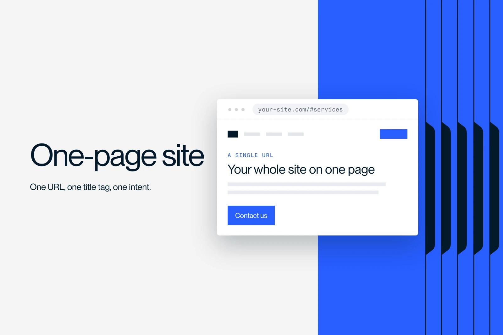
A one-page website puts all of its content on a single URL, with anchor navigation that moves the reader within the document. It is not a simplified version of a traditional site, it is a different format with a precise ceiling: one page means one title, one meta description and a single document to rank. Here are the cases where that ceiling does not get in the way, and the ones where it costs you.
Explore this post with…
The real issue is not design, it is the number of intents
Most articles on the subject list pros and cons. That is not very useful, because the decision is not made by weighing a list. It comes down to a single question: how many distinct search intents does your business need to serve?
With one intent, the format holds. With three, it starts to crack. With ten, it costs you money every month without you seeing it, because the queries you cannot target appear nowhere in your reports. You cannot measure what you never had.
| Situation | Verdict | Why |
|---|---|---|
| Event, launch, time-bound campaign | The right format | One promise, one action, a short lifespan. Nothing to rank over the long term. |
| Portfolio or personal introduction page | The right format | Traffic comes from word of mouth and social networks, not from search. |
| Single product in pre-launch | The right format | Only one intent to serve, and only one message to test. |
| Service business with several offerings | The wrong format | Each offering has its own query. One page cannot target them all. |
| Local business across several cities | The wrong format | Local search is won page by city. A section does not replace a page. |
| Catalog, even a short one | The wrong format | Each item deserves a URL, to be found and to be shared. |
| Site that will need to grow within the year | Avoid | Going from one to fifteen pages later costs more than starting right. |
What you accept when you choose a single URL
The table below lists the real trade-offs and says which ones can be worked around. The right-hand column is the most important: half of these limits have no workaround, so you either accept them or change format.
| What you lose | Detail | Possible workaround |
|---|---|---|
| Title and meta description | One set for the whole site, so a single promise in the results. | None. It is a structural limit. |
| Internal linking | No links between pages, so no hierarchy signal to distribute. | None. Internal anchors are not links between documents. |
| Measurement granularity | A single URL in page reports. | Partial: scroll and click events, provided you set them up. |
| Ranking for multiple queries | A page ranks on one semantic field, not on ten distinct intents. | None, except by leaving the format. |
| Speed | All the content and all the visuals load on a single page. | Real: lazy loading of visuals lower on the page, and serious compression. |
| Targeted sharing | You cannot send someone straight to a specific offer. | Partial: anchors work for people, not for indexing. |
The internal linking row deserves an explanation. A link between two pages passes a hierarchy signal: it tells a search engine which page matters, and on what topic. An anchor within the same document passes nothing of the kind, it only moves the cursor. A one-page site therefore gives up entirely on the lever described in our article on internal linking, which is often the cheapest lever for a young site.
The trap of the page that keeps growing
A one-page site starts short and rarely ends that way. Every new offer, every testimonial, every logo gets added to the same page, and there is nowhere else to put them. After eighteen months, the page weighs several megabytes and visitors scroll through six screens before reaching what interests them.
The Core Web Vitals thresholds, measured at the 75th percentile and updated on May 7, 2025, set the upper limit: LCP is good up to 2,500 ms, INP up to 200 ms, CLS up to 0.1. Staying within these thresholds on a page that holds the entire site takes real work, especially on lazy loading the visuals lower on the page.
The attention argument cuts both ways. The Nielsen Norman Group eye-tracking study published on April 15, 2018, covering more than 130,000 eye fixations from 120 participants, measured 57% of viewing time above the fold and 74% on the first two screens. In other words: people scroll, so a long page is not disqualifying. But whatever sits on the seventh screen is seen by very few people, and on a one-page site, that is often where the contact form is.
Measuring a one-page site without fooling yourself
This is the most often overlooked point. On a traditional site, the journey can be read in the sequence of pages. On a one-page site, there is nothing to read: one visit, one page view, end of report.
The detail that matters, and that few people check: in GA4, a session counts as engaged if it lasts more than ten seconds, or contains at least one key event, or has at least two page or screen views. On a single-page site, that third criterion can never be triggered. Your engagement rate therefore rests entirely on duration and on the events you thought to set up. If you set up none, it measures only one thing: time.
On the Search Console side, average position is defined as the average position of your site's highest-ranking result. With a single URL, that average lumps all your queries together, including unrelated ones. A one-page site therefore makes this figure particularly hard to interpret.
The minimum to put in place: an event when each section is reached, an event on every call-to-action click, and an event on form submission. Without these, you will never know where people stop.
The tipping point
We always see the same two triggers. The first: a second offer arrives that sells to a different audience. The second: the wish to be found in a second city. In both cases, the answer is not to add a section, it is to add a page.
When that moment comes, split by intent, not by section. Not every section of a one-page site deserves its own page: "our team" and "our values" are perfectly fine on the home page. What deserves a page is whatever matches a query you want to target. The framework for thinking about it is website structure.
If you are at the decision stage, compare on the right basis: our guide to brochure website cost gives the real market ranges. A serious comparison is made over two years, not on the initial quote.
The CADvision case
For CADvision, a 3D printing specialist, the challenge was to rank for transactional queries in a very competitive market. This kind of work requires one page per intent: every purchase query has its own expectations, its own objections and its own vocabulary. A section within a long page cannot carry that, because it has no title of its own, no URL to share and no way to be strengthened by links. Synqro is a Webflow Premium Partner agency, and this is the reasoning we apply before signing off on a site structure.
What we recommend
Choose the one-page format if your project has an end date, a single promise, or traffic that will not come from search. It is then the most effective format on the market: it concentrates attention and it is quick to build.
Avoid it if you rely on organic search to bring in customers, if you have several services, or if your business is going to grow. In all three cases, the format will cost you more in a redesign than it saved you at build time. A dedicated landing page, set up alongside a traditional site, often meets the real need much better.
Decide with us
The choice of format is made before the design, and it is hard to go back on. Our team of Webflow experts settles this question with you at the start of the project, and handles building your website in the format that fits your business. Let's talk about your project.
Frequently asked questions
No, there is no penalty tied to the format. The problem is arithmetic, not punitive: a single URL means a single title, a single meta description and a single document to rank. You cannot target ten distinct queries with one page, however good it is.