Article
SaaS landing page: structure, benchmarks and mistakes to avoid
Webflow8 min read

James BrunettoCo-fondateur & CEO
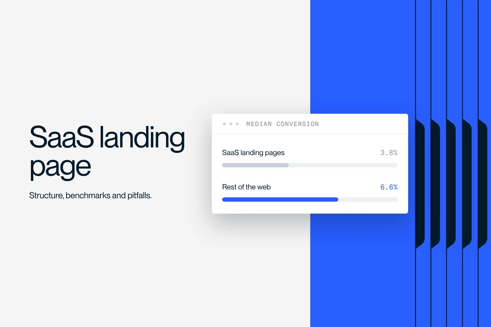
A SaaS landing page is a single page, with no competing navigation, that converts a visitor from a specific source into a trial, a demo or a lead. It is judged on a single number, its conversion rate, and that number has a public benchmark: a 3.8% median for the industry, versus 6.6% across all industries. Here is the structure that holds that level, the trade-offs that matter, and the mistakes that cost the most.
Explore this post with…
The only solid public benchmark
Unbounce's Conversion Benchmark Report is the largest accessible sample on the subject: 41,000 landing pages, 57 million conversions, 464 million page views, based on 2024 data, page updated on July 25, 2025. Unbounce reasons in medians rather than averages, which is the right choice when a few exceptional pages pull everything up.
| Segment | Median rate | How to read it |
|---|---|---|
| All industries | 6.6% | The general benchmark. A SaaS landing page that reaches it is above the pack. |
| SaaS, all segments | 3.8% | Almost half. Long decision cycle, several people involved. |
| Hardware SaaS | 4.1% | The best SaaS sub-segment in the panel. |
| Data and infrastructure SaaS | 3.3% | The lowest. Technical purchase, sign-off by several teams. |
Remember the gap: SaaS converts at roughly half the rate of the all-industry average. That is not a flaw in your pages, it is the nature of the purchase. Several people decide, the decision commits a recurring budget, and the product often requires a migration. Comparing your page with an e-commerce landing page makes no sense.
The channel matters more than the page
The same report breaks results down by traffic source, and the gaps are larger than anything you will get by tweaking a button.
| Channel | SaaS median rate | What it implies |
|---|---|---|
| 16.9% | Already qualified traffic. A page dedicated to this channel can be short and direct. | |
| 9.2% | Low volume in B2B, but clear intent when it is there. | |
| Google Ads | 5.1% | The benchmark paid channel. It is the one that sets the acquisition cost. |
| 3.5% | Below the SaaS median. Keep it for retargeting. | |
| Bing Ads | 1.9% | Marginal volume, do not treat it like Google. |
| Display | 0.3% | Never judge a landing page on this channel alone. |
The practical consequence: a page that converts at 12% on email traffic and a page that converts at 4% on Google Ads can be the same page, equally well built. Before concluding that a landing page is bad, separate the channels. It is the first thing we look at in a conversion rate optimization audit.
The seven blocks, and what each one has to do
There is nothing mysterious about the structure of a SaaS landing page. What separates a page that converts from one that does not is the precision of each block, not how many there are. It fits into a wider whole, covered in our guide to building a SaaS website on Webflow.
| Block | What it has to do | Common mistake |
|---|---|---|
| Headline | Name the problem solved, not the product category. | An abstract slogan that could work for three competitors. |
| Subheadline | Say who it is for, in one line. | Repeating the headline at greater length. |
| Main call to action | One verb, one promise, repeated further down. | Two competing CTAs in the first screen. |
| Immediate proof | Customer logos, usage figure, certification. | A row of logos unrelated to the page's target audience. |
| Visual demonstration | Show the product in action, not a generic illustration. | A screenshot that is unreadable on a phone. |
| Objections | Address the three concerns that come up in demos. | A generic FAQ copied from another page. |
| Action reminder | Repeat the same CTA, with the same word. | A final CTA different from the first, which breaks the promise. |
The block most often gotten wrong is the headline. Many SaaS pages announce a category, "the sales performance management platform", instead of a problem solved. The test is simple: if you can replace your product's name with a competitor's without the sentence becoming false, the headline is not doing its job.
The first screen does three quarters of the work
The Nielsen Norman Group eye-tracking study published on April 15, 2018 is still the reference on the subject. Across more than 130,000 eye fixations recorded from 120 participants, 57% of viewing time is spent above the fold, and 74% on the first two screens.
Two conclusions follow. First: whatever is not in the first two screens is unlikely to be read, so the promise, the proof and the action need to fit there. Second, less intuitive: visitors do scroll, contrary to what the rule of the 2000s claimed, so cutting a useful page down to "fit everything at the top" makes no sense either. The right setting is a long page whose first two screens stand on their own.
Check this on a phone, not on your own screen. A well-composed first desktop screen often turns into three mobile screens where the main button disappears below the fold.
Free trial, demo, or both
This is the trade-off that moves the conversion rate the most, well before layout. The rule we apply depends on the time needed to reach first value. If users get a useful result on their own in under fifteen minutes, the free trial wins. If they need to connect a data source, import history or get permissions approved, the demo converts better, because the trial ends in silent abandonment.
The context is pushing toward self-service. In the Gartner survey published on March 9, 2026, conducted among 646 B2B buyers interviewed in August and September 2025, 67% say they prefer a buying experience without a sales rep, and 45% say they used AI in a recent purchase. A page that offers only a contact form shuts the door on two thirds of its stated audience.
The compromise that works: a main self-service CTA, and a discreet secondary link to the demo for those who want to talk to someone. Not two buttons of equal weight.
What is at stake with speed
On a page fed by paid traffic, every visitor lost before the page displays is a click paid for nothing. The Core Web Vitals thresholds, defined at the 75th percentile and updated on May 7, 2025, set the limit: LCP is good up to 2,500 ms, INP up to 200 ms, CLS up to 0.1.
On SaaS landing pages, two culprits come up again and again: the demo video that autoplays as soon as the page opens, and the pile-up of tracking scripts. A video with deferred playback behind a cover image solves the first. The second calls for a more political decision, because every tool has its champion internally.
The Qobra case
For Qobra, a SaaS company, we built the landing pages and interactive tools. The result is three times the lead volume and sixteen times the organic traffic. What mattered was not an aesthetic redesign: it was pages built one per intent, with an interactive tool that gives a useful answer before any request for contact. Synqro is a Webflow Premium Partner agency, and this is the kind of project we run most often with software companies.
Five expensive mistakes
Keeping the site navigation. A landing page with the site's full menu is not a landing page, it is just another page. Every outbound link is an exit.
Asking for ten fields in the form. Every extra field is a reason to abandon. What your sales reps want to know can often be enriched afterward from the email domain.
Reusing the same page for every campaign. See the channel breakdown above. One page per promise, otherwise you are measuring an average that means nothing.
Showing customer logos unrelated to the target. A large enterprise logo on a page aimed at small businesses has the opposite of the intended effect: visitors conclude the product is not for them.
Testing micro-variations. At a 3.8% conversion rate, you need considerable volume to tell apart two versions that differ by half a point. Test the offer and the headline, not the button color.
Where to start
If you are starting from scratch, the useful sequence is: one page, one traffic source, one CTA, and clean measurement for a month. Only then duplicate by channel. The conceptual basis is in our article on what a landing page is, and the technical implementation in our guide to landing pages in Webflow.
Getting your pages built
A SaaS landing page that stands up to comparison takes as much work on the offer as on the design. Our team of Webflow experts builds these pages and the interactive tools that go with them, and our Webflow SEO agency connects them to organic traffic so they do not depend on paid traffic alone. Let's talk about your project.
Frequently asked questions
The most solid public benchmark is Unbounce's Conversion Benchmark Report, built on 41,000 landing pages and 57 million conversions. The SaaS median there is 3.8%, versus 6.6% across all industries. Below 2%, the problem is rarely the button: it is the message or the traffic.