Article
What is a design system? Definition, parts, cost, examples
Webflow10 min read

James BrunettoCo-fondateur & CEO
A design system is the shared set of rules, components and design values a team reuses to build a consistent interface. It combines design tokens (colours, sizes, type), a component library in Figma and in code, usage rules and documentation. It serves the product and the website, while brand guidelines serve the brand. At Synqro we build them for Webflow sites and custom-coded sites, and we also tell clients when it is too early to need one.
Explore this post with…
What is a design system? The short answer
A design system is a single source of truth for your interface. It defines which colours, sizes and components exist, how they combine, and why.
What separates it from a folder of mockups is reuse. A button is designed once, built once and documented once. Every page then uses it as is.
A good design system answers three questions a team asks every day:
- What to use. The list of available components and their variants.
- How to use it. Usage rules, forbidden cases, examples.
- Why it works this way. The principles that settle a case the documentation never covered.
The term comes from digital product teams. It applies just as well to a marketing website once it grows past a handful of pages and several people work on it.
What a design system includes
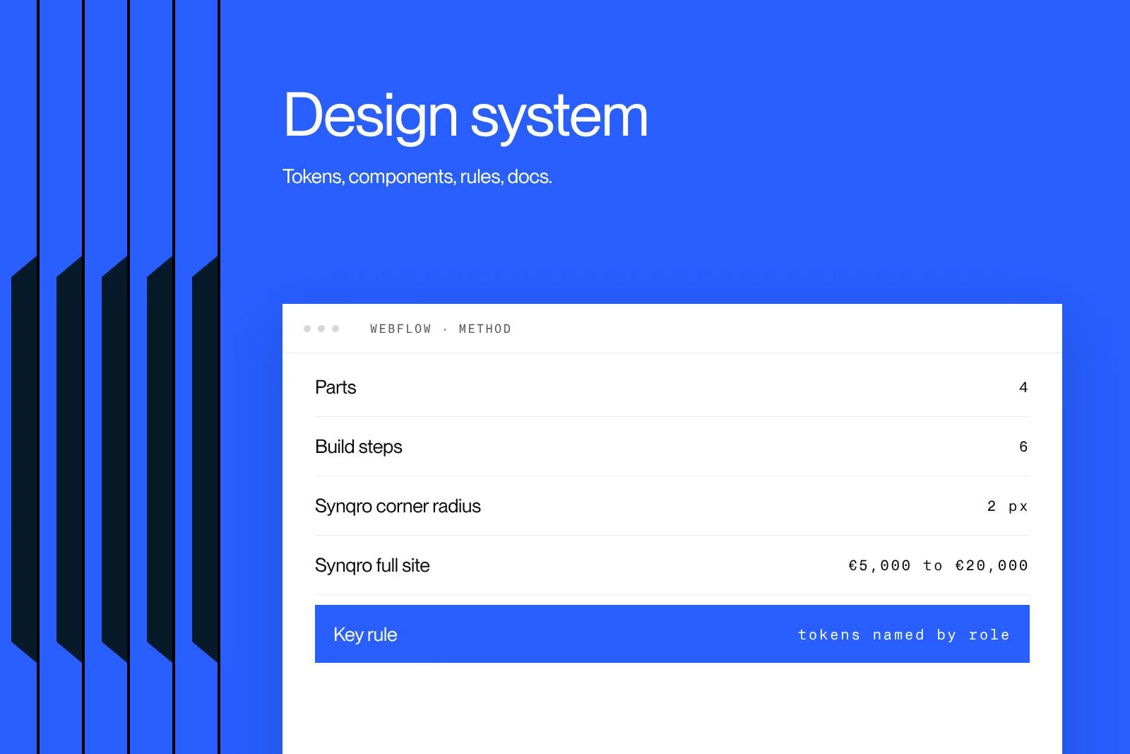
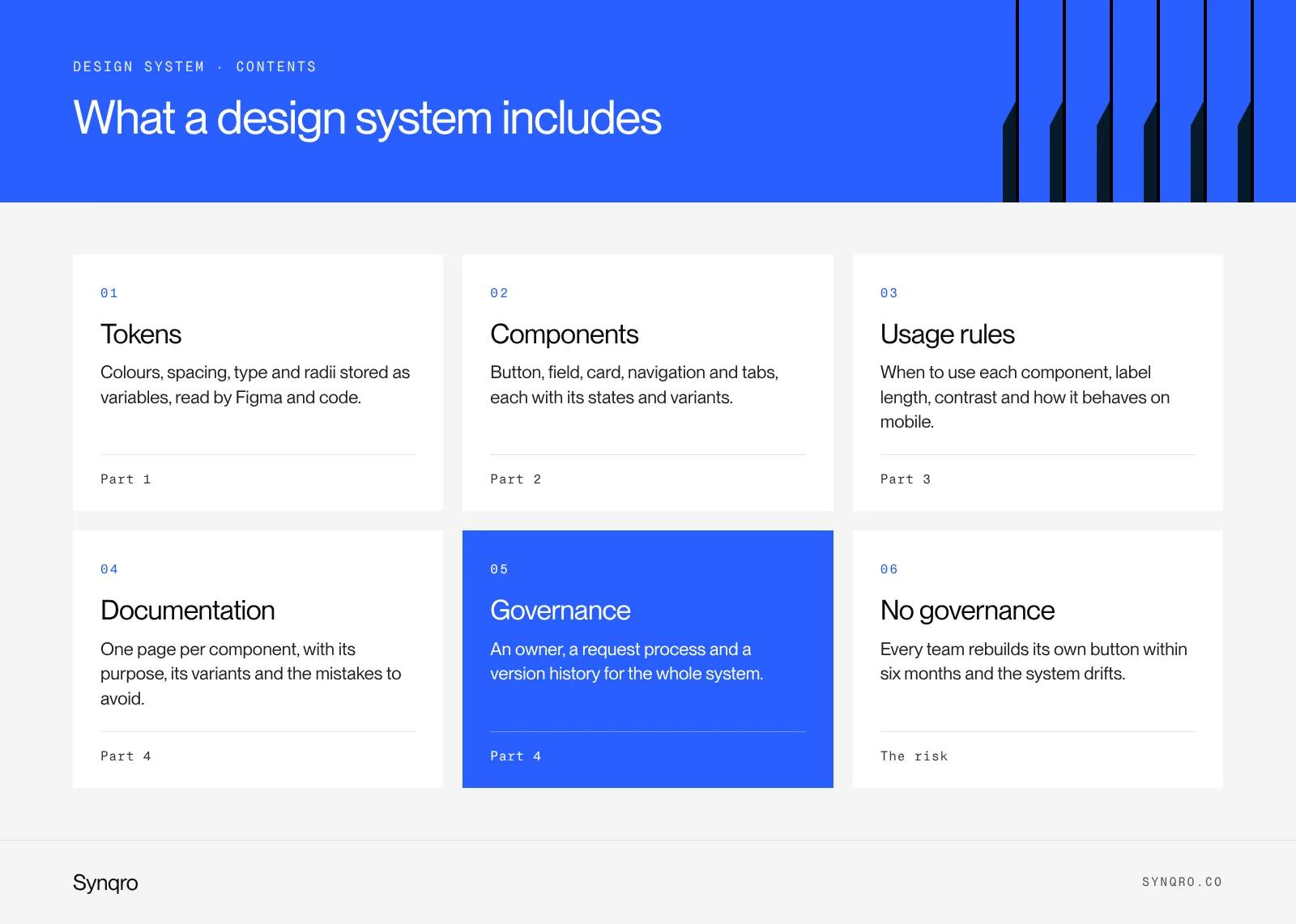
A design system breaks down into four parts. The first three are visible. The fourth decides whether you get a living system or a forgotten Figma file.
Design tokens
Tokens are the smallest design decisions, stored as variables: a colour, a spacing step, a font size, a corner radius, a shadow. Both the design tool and the code read them.
The format is converging on a shared standard. The W3C Design Tokens Community Group released the first stable version of its format specification, version 2025.10, so that Figma, tooling and code can speak the same language.
Components
These are the reusable building blocks of the interface: button, form field, card, navigation, tabs, modal. Each component has states (hover, disabled, error) and variants (primary, secondary). For the nesting logic behind them, see our piece on atomic design and its five levels.
Usage rules
A component without rules ends up misused. Rules say when to use a primary button (once per screen), how long a label can be, which contrast to meet, how the grid behaves on mobile.
Documentation and governance
This is the site or page that brings it all together, with an owner, a process to request a new component and a version history. Without governance, every team rebuilds its own button within six months.
Design system vs brand guidelines vs UI kit
This is the most common mix-up. Brand guidelines describe how the brand looks across every medium. A design system describes how the interface gets built, screen by screen. A UI kit is only one part of a design system: the library of designed components, without the rules or the code.
| Criterion | Brand guidelines | UI kit | Design system |
|---|---|---|---|
| Question it answers | What the brand looks like | Which designed elements exist | How the interface is built |
| Where it applies | Print, web, social, signage | Screen mockups | Website, product, app |
| Contents | Logo, colours, type, visual tone | Components in Figma | Tokens, components, rules, code, docs |
| Linked to code | Rarely | No | Yes, that is the point |
| Who uses it | Marketing, vendors, agencies | Designers | Designers, developers, marketing, product |
| Lifespan | Several years | One project | Evolves continuously, in versions |
A design system does not replace brand guidelines. It inherits from them. The colours and type of your visual identity become tokens, then components.
A real example: the tokens behind Synqro's brand
Instead of a textbook example, here is how our own brand becomes a design system. It rests on very few decisions, on purpose.
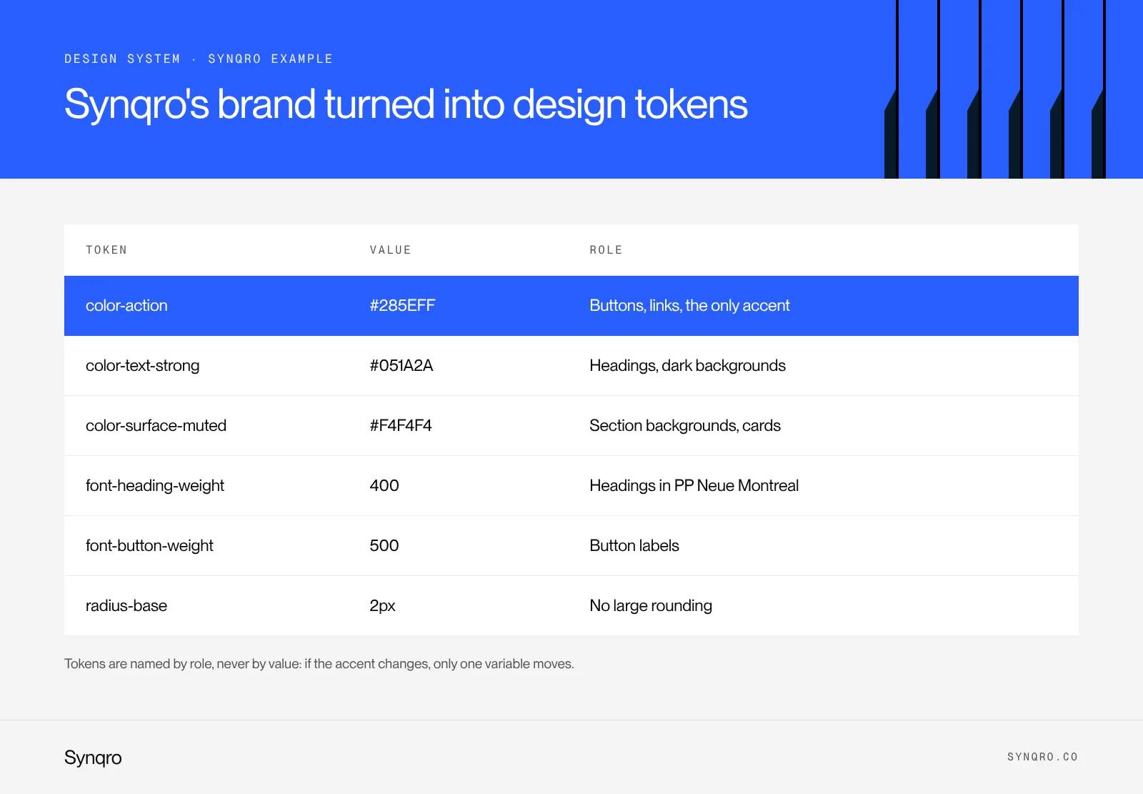
- Colour. Blue #285EFF, night #051A2A, light grey #F4F4F4. One accent only, the blue.
- Type. PP Neue Montreal, Regular 400 for headings and Medium 500 for buttons.
- Shape. 2 px corners, no large rounding.
As tokens, these decisions are named by role, never by value. We do not write "blue-285", we write "color-action". The day the accent changes, one variable moves and the whole site follows.
| Token | Value | Role in the interface |
|---|---|---|
| color-action | #285EFF | Buttons, links, active state, the only accent |
| color-text-strong | #051A2A | Headings, body text, dark backgrounds |
| color-surface-muted | #F4F4F4 | Section backgrounds, cards, soft dividers |
| font-heading-weight | 400 | Headings in PP Neue Montreal Regular |
| font-button-weight | 500 | Button labels in PP Neue Montreal Medium |
| radius-base | 2px | Buttons, fields, cards, no large rounding |
At Synqro, we judge a design system by what it rules out. A single accent and a single 2 px radius stop the usual drift, where every new page adds its own shade of blue and its own corner. Fewer tokens means fewer decisions to make again.
When a B2B company needs one, and when it is too early
A design system takes time to build and time to maintain. It pays off once enough people and pages depend on it.
You need one if:
- Several teams touch the interface. Marketing on the website, product on the app, an agency helping out.
- The site grows fast. New landing pages every month, product pages, several languages.
- You run a SaaS product and a website. Both need to share one visual language.
- Inconsistency already costs you. Three button styles, mismatched forms, endless QA rounds.
It is too early if:
- You have a ten-page brochure site run by one person.
- The brand is not settled yet. Building a system on an identity about to change means paying twice.
- There is no digital product and few new pages planned.
Our house rule: while the interface has one team and one surface, we deliver a clean component library, not a full design system with governance. The system comes when a second consumer shows up.
How to build a design system, from Figma to Webflow or code
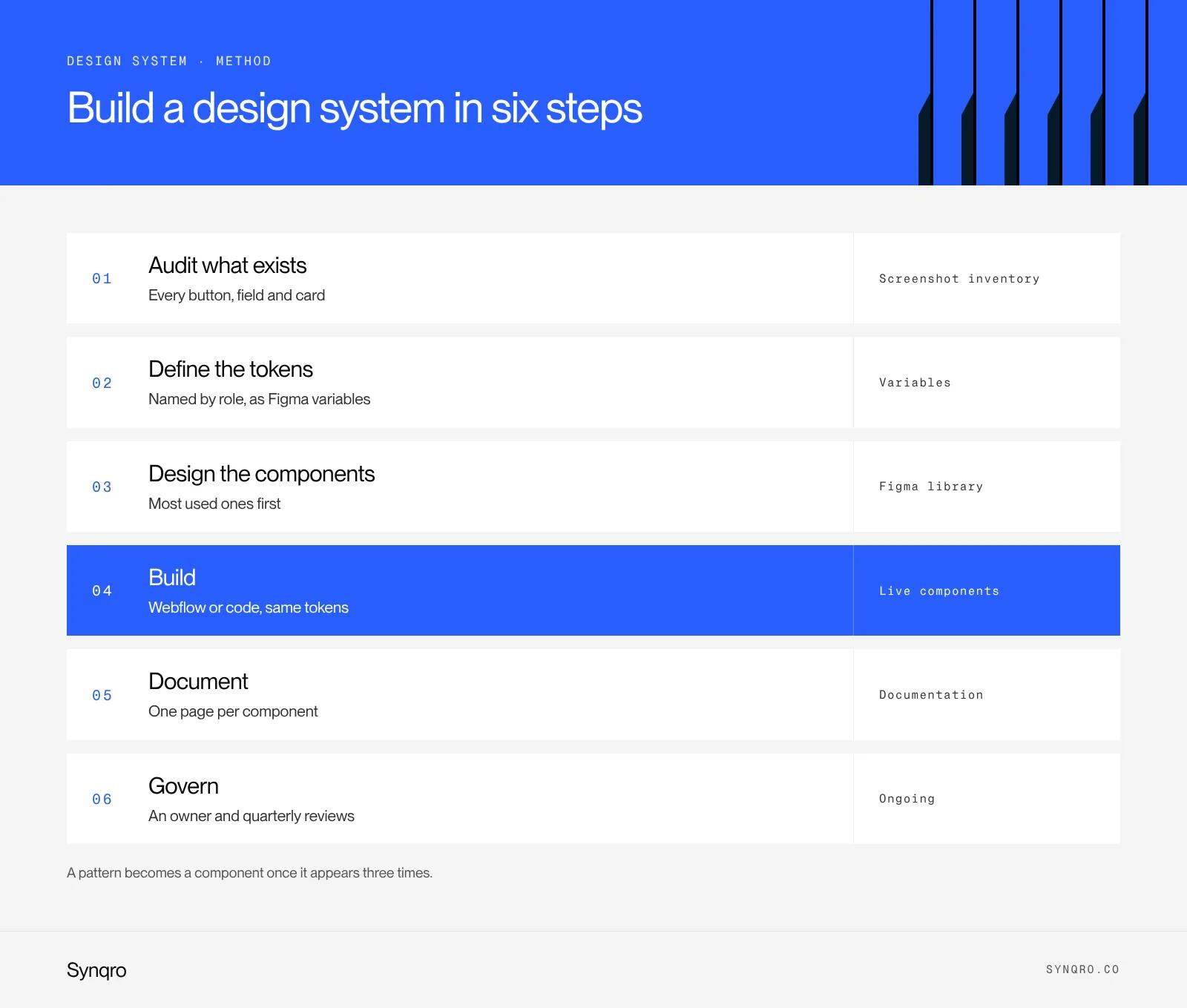
This is the order we follow at Synqro. Each step produces something usable, even if the project stops there.
- Audit what exists. Screenshot every button, field, card and heading. You usually find four or five versions of the same element.
- Define the tokens. Colours, spacing, type, radii, named by role. In Figma, create them as variables.
- Design the components. Start with the most used: button, field, card, section header. A pattern becomes a component once it appears three times.
- Build in the final tool. In Webflow, tokens become variables, classes follow a convention such as the Client-First method, and blocks become Webflow components with props and variants. In code, tokens feed CSS variables and a component library.
- Document. One page per component: what it is for, its variants, mistakes to avoid, an example.
- Govern. An owner, a request process, a regular review. At Synqro, we cover this in the quarterly reviews we hold with long-term clients.
The Freelance Republik case
For Freelance Republik's website rebuild, the design was led by the agency Bruno. The site had twenty pages, each with layouts specific to the brand, and one requirement: the marketing team had to be able to evolve it on its own. Our job was to turn that distinctive design into a system of reusable components, sections and page templates in Webflow, without losing the custom layouts that define the brand.
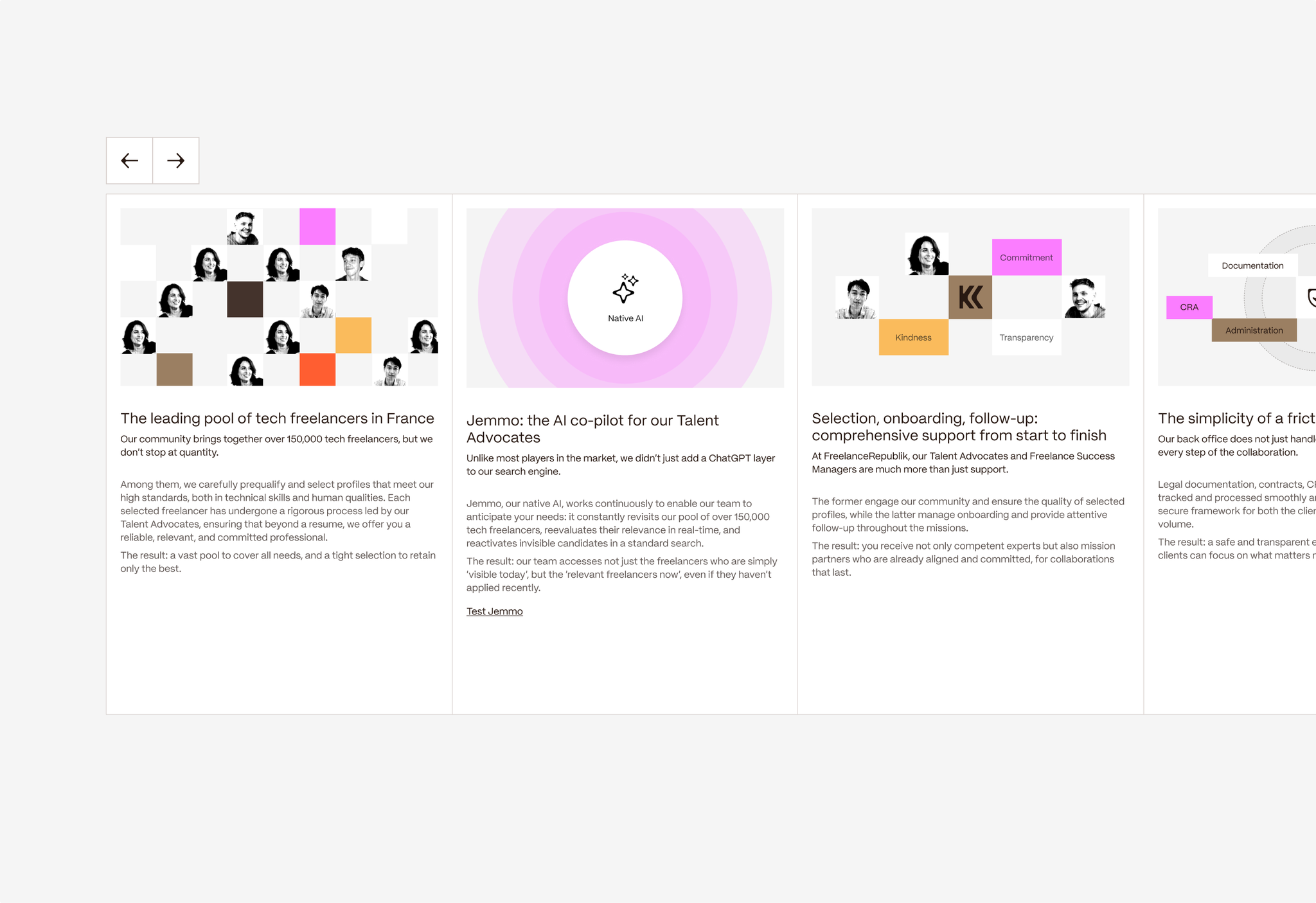
That is exactly what a design system does for a marketing site: it keeps what makes the brand distinctive and removes the need for a developer on every new page.
Webflow or code: where your design system lives
The tool changes how the system is applied, not its logic.
| Criterion | Design system in Webflow | Design system in code |
|---|---|---|
| Tokens | Webflow variables | CSS variables or a tokens file |
| Components | Webflow components, props, variants, slots | Versioned component library |
| Who edits | Marketing on its own, within limits | Developers, through the repository |
| Sharing across sites | Webflow shared libraries | Package installed in each project |
| Best for | Marketing site, landing pages, blog | SaaS product, app, multiple front ends |
For a B2B website run by marketing, Webflow is often the right home. When one system must serve both an app and a website, we start from code and keep Webflow aligned on the same tokens. If you are starting from a mockup, our guide to building a website mockup in Figma sets the groundwork.
How much a design system costs and how long it takes
The budget depends on what you mean by design system. These are two very different projects.
- A marketing site system. Tokens, components and page templates delivered with the site. At Synqro it is part of the website project: a full site costs €5,000 to €20,000 excluding VAT and ships in 8 to 12 weeks.
- A product design system. It covers the app, several teams, dedicated documentation and governance. Its price depends on the number of components and screens, and it runs over several months with ongoing maintenance.
The hidden cost is maintenance. A design system with no owner loses its value within months, because teams go back to building outside the system.
Public design system examples worth studying
The big public design systems are a good school, as long as you do not copy them wholesale. They were built for organisations far larger than yours.
- Carbon, by IBM. Carbon is IBM's open source design system for its products and digital experiences, with working code, design tools and interface guidelines.
- Material Design, by Google. The best known reference, very complete, designed first for Android and Google apps.
- DSFR, the French government's design system. Built since 2020 by the French Government Information Service, it is a mandatory standard for French state websites. Its official site lists 50 components and page templates.
What we take from them at Synqro: every one of these systems started small, with tokens and a handful of components. For a mid-sized company, borrowing their structure is useful. Copying their scale is a mistake.
Mistakes that kill a design system
- Starting with rare components. The complex data table before the button.
- Naming tokens by value. "Grey-F4" is wrong the moment the colour changes.
- Keeping the system in Figma only. Without a link to Webflow or code, it drifts within a week.
- Skipping documentation. An undocumented component gets used the wrong way.
- Naming no owner. Nobody says no, everyone adds.
If you want to know whether your site needs a full system or just a well-organised library, our team builds component-based Webflow sites and can review your current interface. You can also get in touch directly.
Frequently asked questions
It is the set of tokens, components, usage rules and documentation a team reuses to build a consistent interface, on the website and in the product.