Article
Atomic design: the 5 levels, the method and its limits
Webflow8 min read

James BrunettoCo-fondateur & CEO
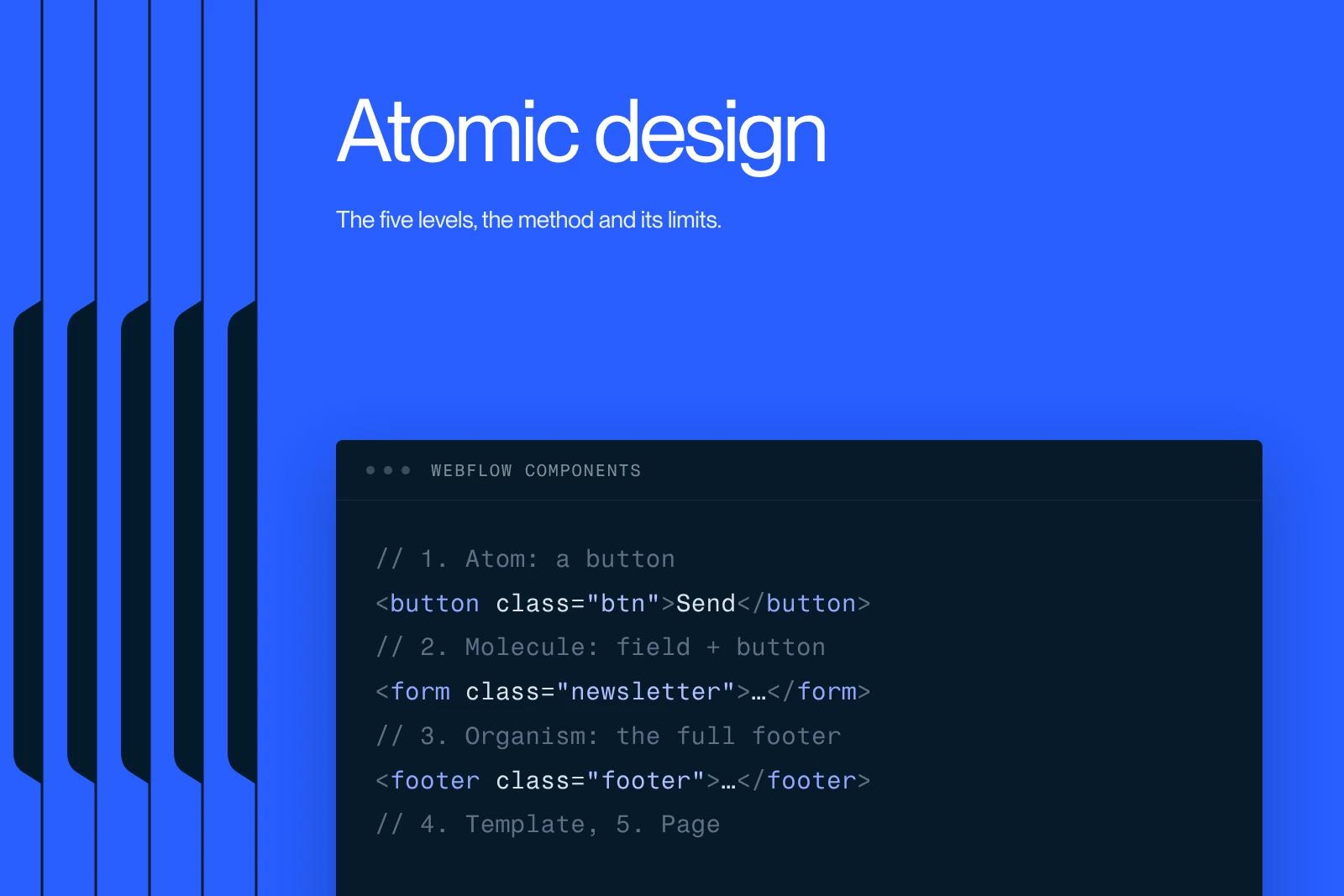
Atomic design breaks an interface down into five nested levels, from the smallest elements to complete pages. Here is what each level brings, what the method does not solve, and how to turn it into real components.
Explore this post with…
Atomic design is an interface design method that organizes the UI into five nested levels: atoms, molecules, organisms, templates and pages. Each level is made of the one before it. An input field and a button are atoms; together with their label they form a molecule, a search bar; placed in a header with the logo and navigation, it becomes an organism. The method was set out by Brad Frost in a 2013 article, then in a book whose text is still freely available at atomicdesign.bradfrost.com.
The central idea fits in one sentence: you design a system, not pages. The pages follow from it.
The five levels, with an example that holds up
Atoms. The indivisible elements: a color, a font weight, a button, a field, a label, an icon. On its own, an atom is useless. Yet this is the level where accessibility and consistency are decided: insufficient contrast on the primary button spreads across the whole interface.
Molecules. Two or three atoms grouped to perform a specific function. A label, a field and a button form a search block. It is the first level where the whole actually does something.
Organisms. Self-contained sections made of molecules and atoms: a full header, a product grid, a contact form, a footer. An organism can move from one page to another without breaking.
Templates. The structure of a page, with its zones and hierarchy, filled with placeholder content. This is where you check proportions and flow, not the copy.
Pages. The template with real content. It is the only level where you discover what does not work: a six-word heading that turns out to be nineteen, a product card with no image, a twelve-column table. Never skip this step. It exists to break the system before users do.
Atomic design and design systems: clearing up the confusion
The two terms are often used interchangeably. They do not mean the same thing.
Atomic design is a taxonomy, a way of sorting and naming interface building blocks. A design system is a product: a library of real components, design tokens, usage documentation, and governance that says who decides and how a change gets approved.
You can build a design system without ever saying the word atom. The reverse is true too: sorting Figma screens into five folders does not create a design system, it creates five folders. The method provides a shared vocabulary. It replaces neither documentation nor decisions.
Where the method falls short
It needs saying, because most articles on the topic do not say it.
The line between molecule and organism is endlessly debated. A product card with an image, title, price and button: complex molecule or small organism? The question has no answer, and teams lose hours over it. The most practical convention is to decide on autonomy: if the element makes sense placed on its own on a page, it is an organism.
The chemistry metaphor does not speak to clients. In a meeting with a marketing leadership team, explaining that you will approve the molecules before the organisms loses the room. Many teams keep the structure and change the names to elements, blocks, sections, templates, pages. The result is the same and the conversation is simpler.
Five levels is sometimes too many. On an eight-page brochure site, the full hierarchy costs more time than it saves. Three levels are enough: elements, sections, pages.
The breakdown says nothing about consistency. You can produce forty atoms that are inconsistent with one another. Design tokens (colors, spacing, type scales) are what hold consistency, not the taxonomy.
The classic criticism about losing creativity, however, does not hold. A well-built system frees up time on repetitive screens and lets you spend more of it on the pages that carry the brand. It is the opposite of uniformity, provided the system includes documented escape hatches.
Turning atomic design into Webflow components
The method is only worth something if it survives the move to production. Here is the mapping that works in practice.
| Level | Concrete example | Webflow equivalent |
|---|---|---|
| Atom | Color, type scale, button, field | Site variables, base classes, text styles |
| Molecule | Search block, testimonial card | Small component with its text and link props |
| Organism | Header, article grid, footer | Component with variants and slots |
| Template | Structure of an article page | CMS collection page |
| Page | The real article, with its real title | Published collection item |
A working mapping, to adapt to the size of the project. On a site of fewer than ten pages, merging molecule and organism saves time.
Two conditions make it hold. First, a strict class naming convention, without which the library turns into a graveyard of variants; the Client-First method remains the reference here. Second, real use of components, with their props and variants, rather than copied blocks. We cover this in our article on custom Webflow components.
Where to start, in practice
Do not start with the atoms. It is counterintuitive, yet it is the only approach that gets anywhere.
Start with an interface inventory: list every existing button, every heading style, every card. You will find thirteen grays and five primary buttons. That inventory is the argument that unlocks the budget.
Then take two or three templates that are actually in use and work back up the chain: which organisms make them up, which molecules sit inside, which atoms underneath. You end up with a library that is useful rather than exhaustive.
Keep the library alive in the same place as the design work. The handoff from the Figma mockup to the build is where systems come apart, and our Figma to Webflow guide explains how to limit the damage. Finally, have the atoms themselves carry the accessibility rules (contrast, target size, focus state) rather than dealing with them at the end of the project, as we explain in our article on web accessibility.
What it changes for a team
The real benefit is not tidy organization. It is autonomy. A team with a named, documented library creates its pages without going back to the agency every time.
That is exactly what we set up for Elevo: Webflow development and training, with the goal of a team that runs its own site. Without a clear component system, training does not last three months, because every new page starts from a copy of the last one and consistency dissolves. The bigger picture is laid out in our article on web design.
Synqro is a Webflow agency and Premium Partner that works with companies in Paris and across France. We build these libraries and train the teams who use them. Let's talk about your system.
Frequently asked questions
It is a method that breaks an interface down into five nested levels (atoms, molecules, organisms, templates and pages) to design a system of reusable components rather than independent screens.