Article
Wireframe: Definition, Fidelity Levels and Method
Webflow10 min read

James BrunettoCo-fondateur & CEO
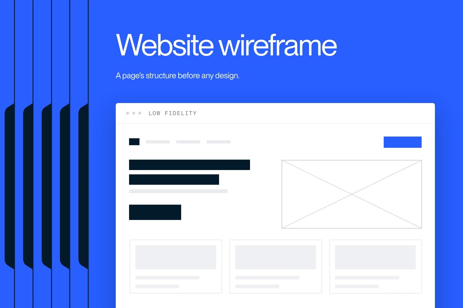
A wireframe sets the structure of a page before any visual decision. It's the most cost-effective step in a web project, and the one most often skipped.
Explore this post with…
A wireframe is a grayscale diagram that sets the structure of a web page before any visual decision: which blocks, in what order, with what hierarchy and which calls to action. It's an architect's plan, not a picture of the finished site.
It's also the most cost-effective step in a web project, and the one most often skipped. Fixing the order of blocks on a wireframe takes ten minutes. Fixing it once the site is built takes a week and a budget renegotiation.
What a wireframe is, and what it isn't
Nielsen Norman Group defines a wireframe as a document that shows page-level design and layout ideas, mainly used for products with several distinct pages. The definition is deliberately dry: a wireframe answers questions of structure, not style.
In practice, a wireframe settles four things:
- the order of blocks on the page and what is visible without scrolling;
- the heading hierarchy, and therefore the information hierarchy;
- the position and number of calls to action;
- the amount of content each block will have to hold.
And it doesn't settle colors, final typography, photos, animations or micro-interactions. Everything that belongs to art direction comes later, on the mockup.
The most common confusion is about the third term, the prototype. Here is how the roles really split.
| Deliverable | What it shows | What it lets you decide | When |
|---|---|---|---|
| Zoning | Labeled rectangles, no content | How the main areas of the page are split | Scoping workshop |
| Wireframe | Structure, hierarchy, approximate content, in gray | Block order, headings, calls to action | Before design |
| Mockup | The final, static visual rendering | Art direction, components, states | After the wireframe is approved |
| Prototype | Linked, clickable screens | User flows, transitions, error cases | Before development |
The three fidelity levels, and how to choose
Fidelity measures how closely a deliverable resembles the final product. Nielsen Norman Group breaks it down into three independent dimensions: interactivity, visuals, and content with navigation. So you can have a wireframe that is very detailed in content and very bare in visuals, which is actually the goal.
Low fidelity
Paper, whiteboard or gray boxes. You draw fast, you throw away fast. This is the level to favor as long as the structure isn't locked, for two reasons documented by Nielsen Norman Group: changes can be made during the test itself, and participants criticize a visibly unfinished document more freely. Their phrasing sums it up: tearing up code is expensive, tearing up a prototype is not, especially if it's a sheet of paper.
Medium fidelity
The professional standard. Clean gray boxes, real headings, real text lengths, a consistent grid, no brand colors. At this level a client can sign off without reviewing the wrong thing, because there is nothing pretty to comment on.
High fidelity
Close to the mockup, sometimes clickable. Useful when you test a specific component, a conversion funnel or a sequence of screens. The risk is well known: a wireframe that looks too finished triggers comments on color and pushes structure into the background.
What a usable wireframe must contain
A useless wireframe is a wireframe without content. Here is the checklist we apply before we consider a template ready for sign-off.
- Real headings. No placeholder text on H1s and H2s. A real heading instantly shows whether the block holds up.
- Real lengths. If the paragraph will be 400 characters, it's 400 characters in the wireframe. A block sized for three lines that ends up with twelve breaks the page.
- Only one primary call to action per screen. The others are secondary and should look it.
- Empty states and errors. A list with no results, a rejected form, an empty cart. This is where projects go off track in development.
- The mobile version. Not an afterthought: the block order often changes, and that's a decision, not a side effect.
- Outgoing internal links. Which pages this template links to, and from which block.
Design teams forget this last point most often, and it's the one that weighs most on search rankings once the site is live.
Wireframing tools in 2026
The tool matters much less than the discipline, but you might as well know the real costs. Prices taken from the official pricing pages in September 2026.
| Tool | Cost | Best for |
|---|---|---|
| Paper and marker | 0 euros | The exploration phase, no exceptions |
| Figma | Free up to 3 projects and 2 members, then 12 dollars per editor per month billed annually, 15 dollars monthly for the Professional plan, 45 dollars annually for Organization | The standard for product teams and agencies |
| Webflow directly | Included in the site plan | Simple structures, when the wireframe becomes the site |
One note on Figma: billing is per editor, not per viewer seat. Client-side reviewers don't need a paid license, which changes the budget of a project with several stakeholders.
When the wireframe goes straight to becoming the site, it's better to have a Webflow expert set up the class structure at this stage: what you create here stays, and a sloppy class tree at the wireframe stage costs you for the whole life of the site.
Our 5-step method
This is the sequence we follow on redesign projects, and it explains why we rarely need more than one round of revisions on the mockup. It also shapes the time it takes to build a website: every round of revisions avoided shortens the schedule.
- Set goals page by page. One page, one measurable goal. If nobody knows what the page should produce, the wireframe has nothing to structure.
- Inventory the existing content. What you keep, what you rewrite, what goes away. A wireframe drawn before the content inventory is a gamble.
- Define templates, not pages. Six to eight are enough for most B2B sites. The logic is that of atomic design: you build pages from reusable blocks.
- Wireframe in medium fidelity, desktop and mobile. With real headings and real lengths.
- Get sign-off from the business decision-maker. Approval on the structure before opening a single design file.
On the Qobra redesign, this upfront sign-off is what kept the schedule on track: the template structure was locked before art direction started, so no blockers came up during the build phase.
The most expensive mistakes
Skipping the step. This is the original mistake. You jump straight to the mockup, the discussion drifts to aesthetics, and the structure is never really decided. It then gets decided in development, by default, by whoever builds the page.
Using placeholder text. Lorem ipsum gets blocks approved that won't survive real content. It's the most common reason pages fall apart at the last minute.
Drawing pages instead of templates. Forty wireframes for forty pages means the same decision made from scratch forty times, and a site with no consistency.
Forgetting mobile. More than 44 percent of web traffic in France happens on mobile, according to StatCounter in August 2026. A block order designed only for large screens translates poorly, and it shows in conversion rates.
Not planning room for SEO content. A landing page designed with three two-line blocks can't rank. Content volume is a structural decision, and it's made at the wireframe stage.
Wireframes and SEO: the direct link
Four decisions made at the wireframe stage shape a page's search performance, and none of them is easy to fix afterward.
First, the heading hierarchy. A single H1, H2s that actually break down the topic, not decorative H2s on two-line blocks. Next, the position of the main content: if it comes after four trust-building blocks, it sits far down the document. Then the planned text volume, which determines whether the page can cover its topic. Finally, outgoing internal links, meaning which pages this template links to and from where.
That's why we have the person in charge of SEO review the wireframes before sign-off, not at launch. On a website redesign, it's the only moment when fixing these four points costs nothing.
What skipping it really costs
The math is simple. A structural change approved at the wireframe stage takes a few minutes. The same change after the mockup means reworking the art direction. After the build, it means development, a new round of QA, and sometimes a URL redirect. The typical website budgets we break down in our article on the cost of a brochure website make the comparison obvious: the wireframe is the cheapest line on the quote and the one that protects all the others.
And if your goal is conversion rather than just going live, it's even more true. The optimization tests described in our guide to CRO nearly all concern structural decisions: block order, call-to-action position, form length. You might as well get them right the first time.
Synqro is a Webflow Premium Partner agency that works with companies in Paris and across France. Planning a redesign and want the structure to serve SEO from day one? We work in exactly this order, from wireframe to launch. For a project in Paris, see our Webflow agency in Paris page. Explore our Webflow SEO services or let's talk about your project.
Frequently asked questions
The wireframe sets the structure and information hierarchy, in gray, without a visual identity. The mockup applies art direction to that structure: final colors, typefaces, images and spacing. You approve one before starting the other, otherwise the debate over a button's color hides the real issue, which is the order of blocks. Details in our guide to website mockups.